Design
Guide
OXD Introduction
Design Thinking
UX Standards
Visual Design
Grid & Layout
Navigations
Components
 UI Behaviours
 UI Standards
Buttons
Text-box
Check-box
Radio
Radio Pills
Switch
Search-box
Multi Select
Dropdown
Number Dropdown
Upload Inputs
Upload input box
Date picker
Time picker
Color picker
Labels
Help Label
Status label
Group Input
Group Overlay
Scroll-bar
Count Slider
Text-area
Comment-box
Paginations
Card loader
Divider
Tables & List View
Cards & Shapes
Modals & Popups
Advance Components
Charts
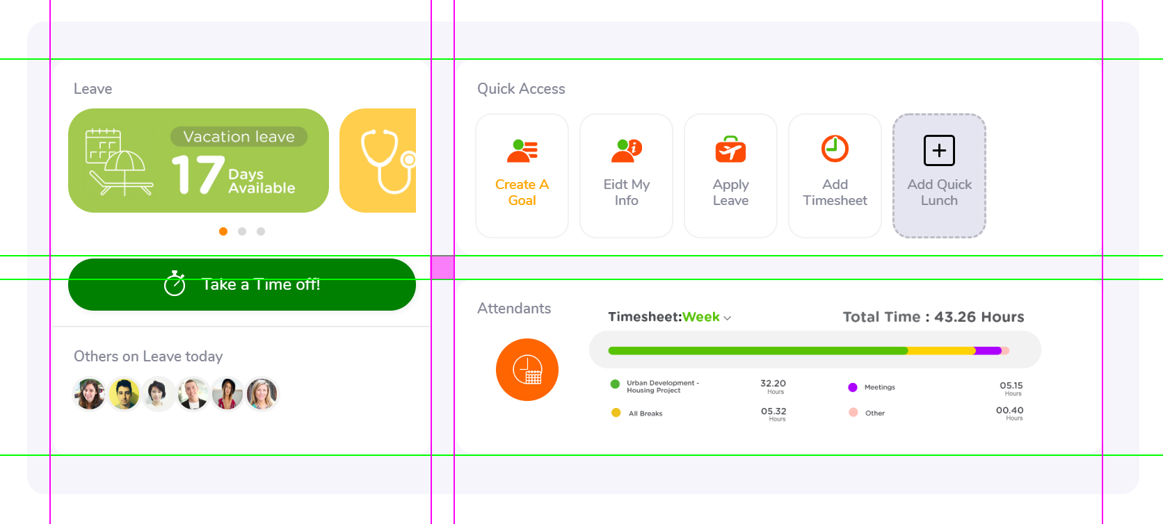
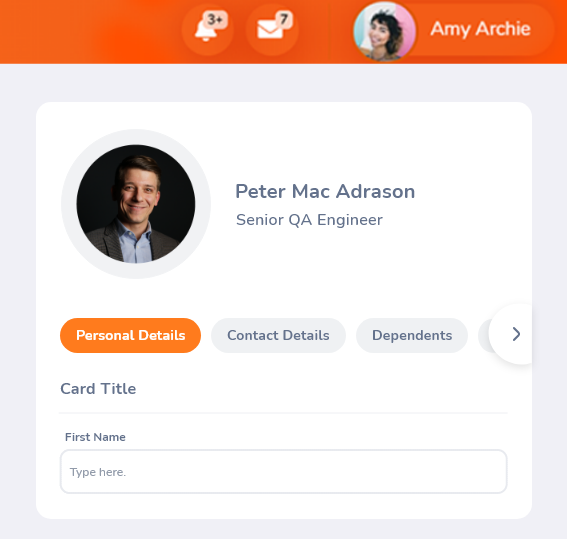
Cards & Shapes
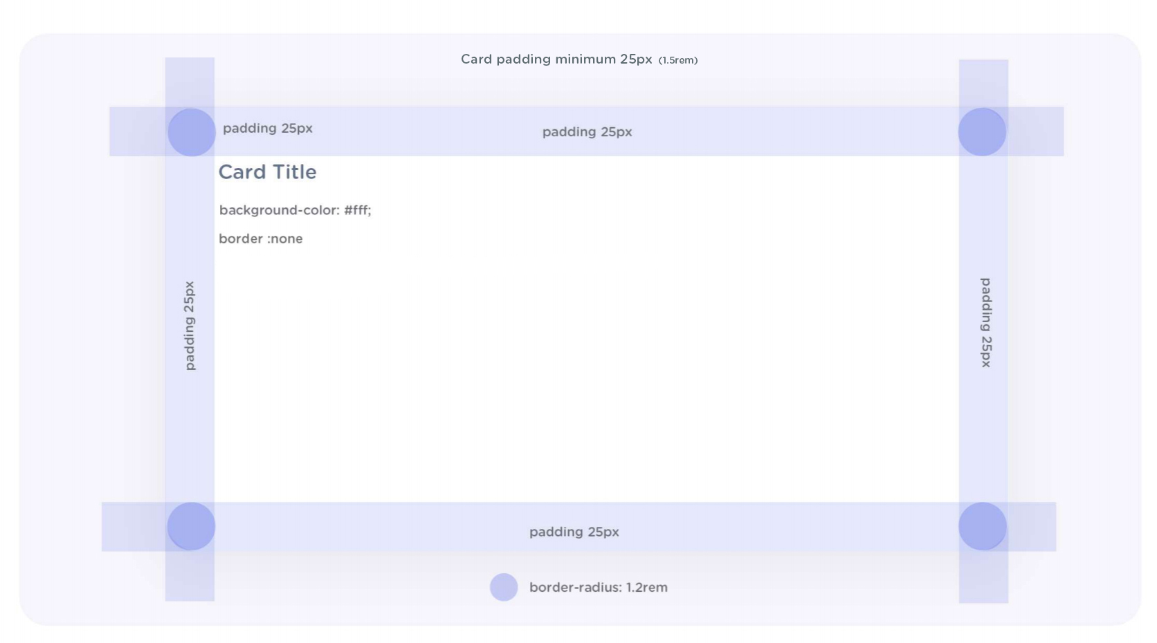
All the cards have rounded shapes according to the design language. and also have good proximity and negative spacing for breath around the content. and for better readability.
Cards breakdown
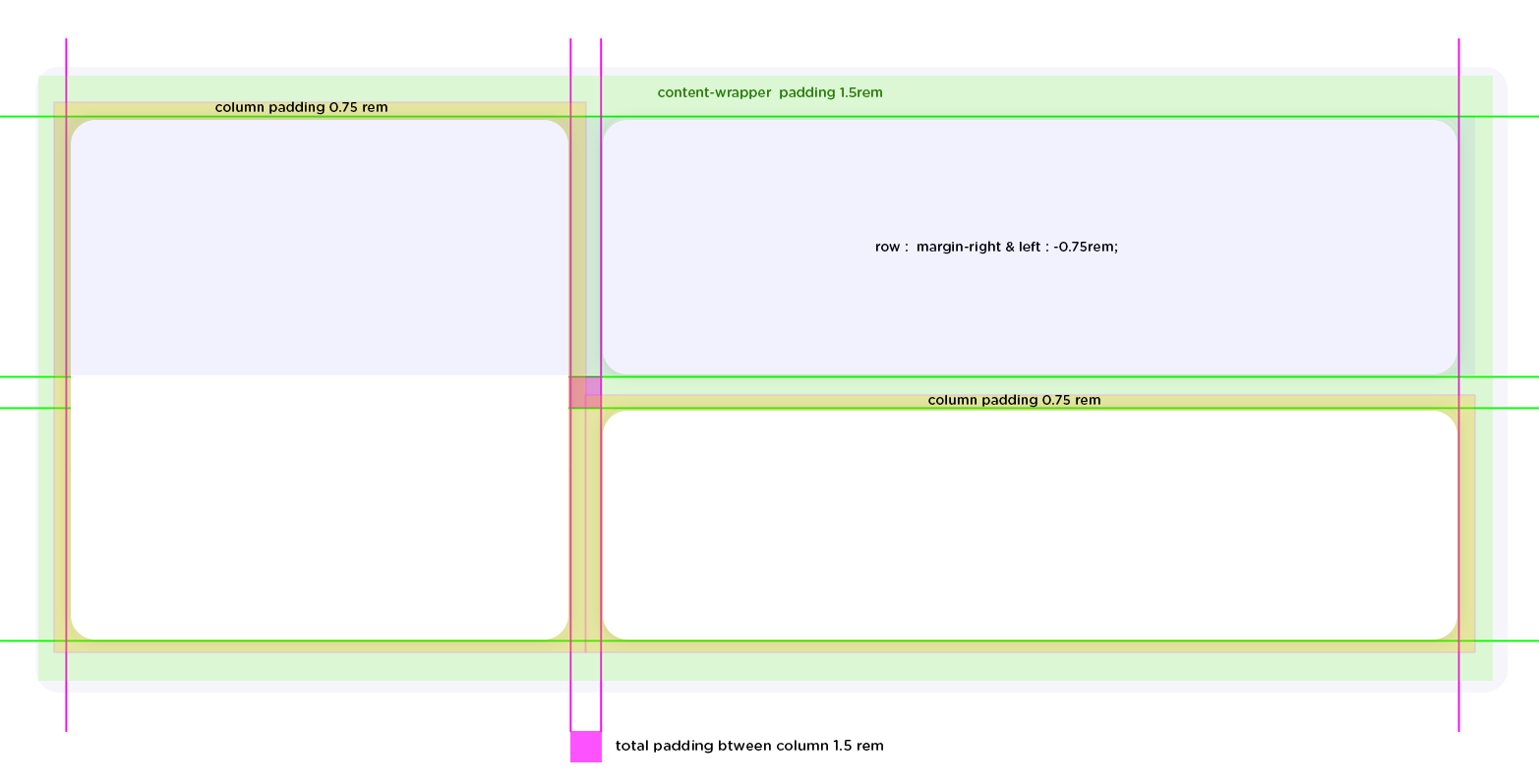
Main containe & column, row paddings
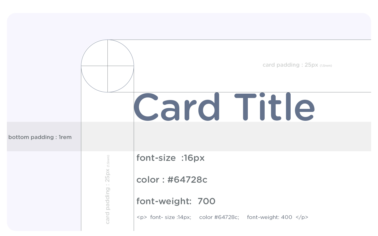
Card inside
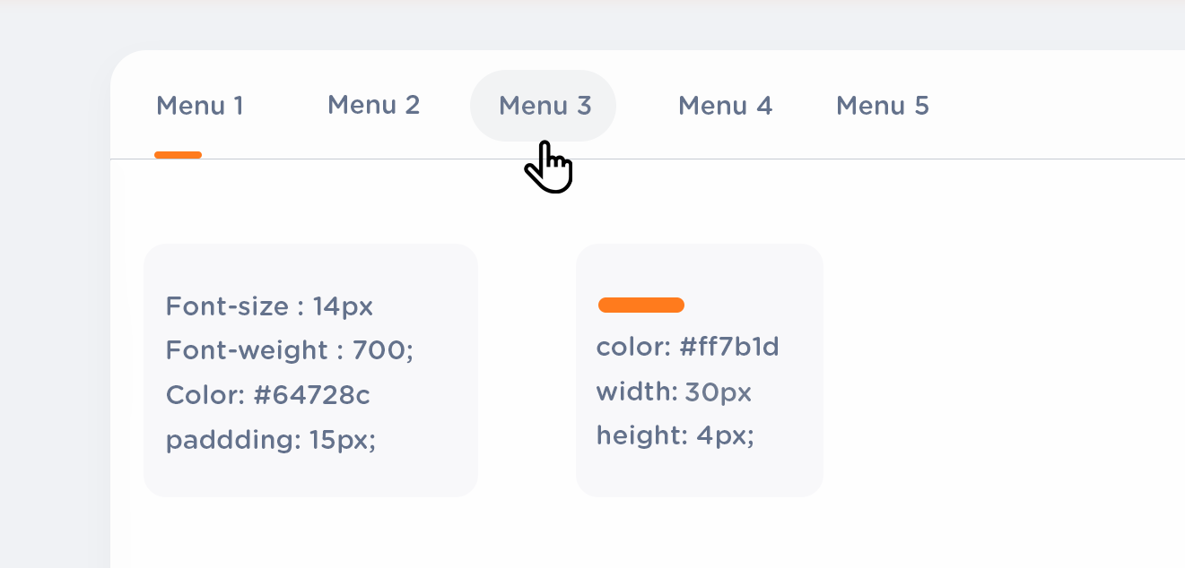
Card Tab menu
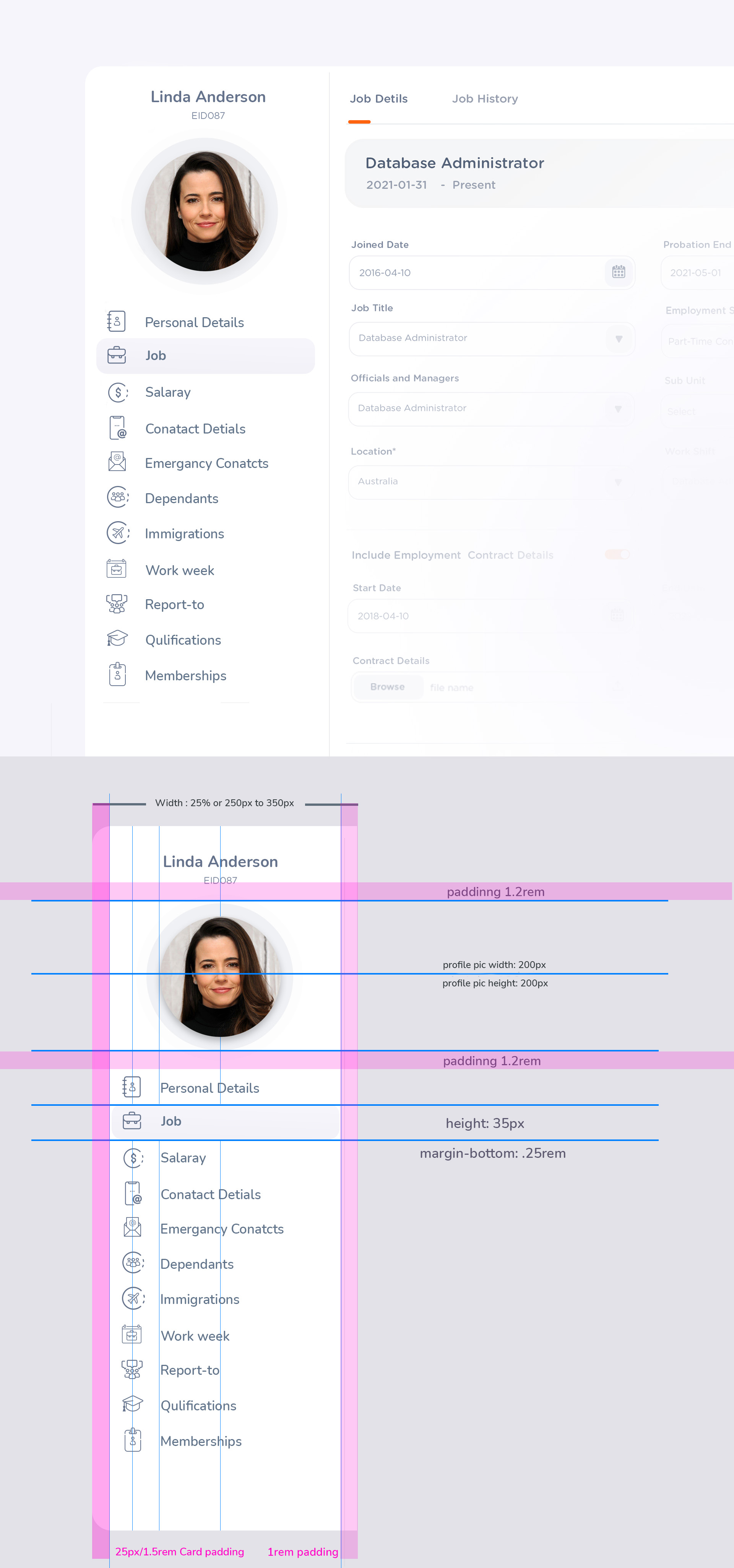
Card Side Menu
Side-bar Code Example
                    .Sidebar-menu item {
                    height 35px;
                    margin-bottom: 0.25rem
                    background-color: #fff;
                    border-radius: 0.85rem;
                    background-color:f6f5fb;
                    background-image: -moz-linear-gradient( -92deg, rgb(246,245,251) 0%, rgb(221,219,228) 100%);
                    background-image: -webkit-linear-gradient( -92deg, rgb(246,245,251) 0%, rgb(221,219,228) 100%);
                    background-image: -ms-linear-gradient( -92deg, rgb(246,245,251) 0%, rgb(221,219,228) 100%);
                  }

                  Propic-round overly
                  {
                    width: 120px;
                    height:120px;
                    padding 100px;
                    background-color:f6f5fb;

                  }

                  propic-shadow{
                  box-shadow: 1px 1px 18px 11px hsl(238deg 13% 76% / 24%);
                }
Card Side Menu- Mobile
Card Side Menu (Mobile)- Code Sample
                    Propic-round overly
                    {
                      width: 120px;
                      height:120px;
                      padding 100px;
                      background-color:f6f5fb;

                    }

                    propic-shadow{
                    box-shadow: 1px 1px 18px 11px hsl(238deg 13% 76% / 24%);
                  }
                  Topbar-menu item {
                    background-color: #fff;
                    border-radius: 0.85rem;
                    margin-right: 0.625rem;
                    margin-top: 1rem;
                    margin-down: 1rem;
                    selected-tab-fill-color:#FF7B1D;
                    font-size: 14px;
                    font-weight: 700;
                    color: #fff;
                    unselected-tab-fill-color:#64728C(10% a);
                    font-size: 14px;
                    font-weight: 700;
                    color: #64728C;
                    min-height: 35px;
                    padding: 8px 16px 8px 16px;

                  }

                   Slider_icon_right {
                    fill: rgba(255,255,255,1);
                    drop-shadow(0px 3px 8px rgba(0, 0, 0, 0.11));
                    width: 67px;
	               	  height: 84px;
                    angle_icon fill: rgba(100,114,140,1);

                }
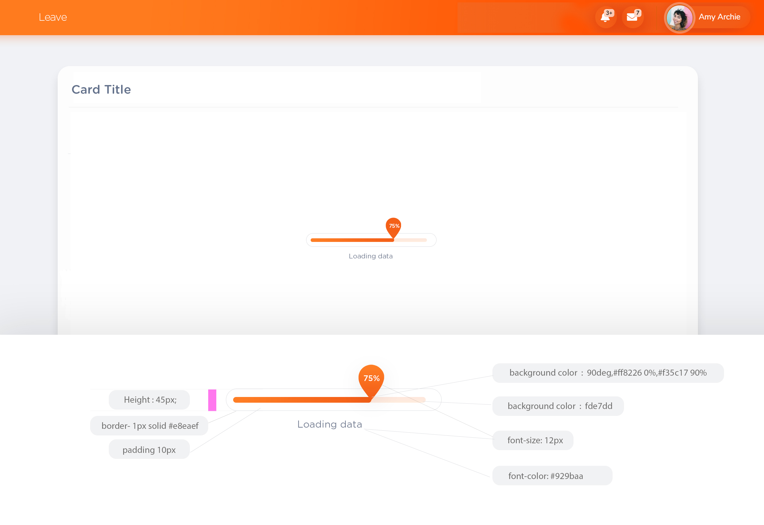
Card Loading
if the loading time less than <3 seconds use the Loading Spinner
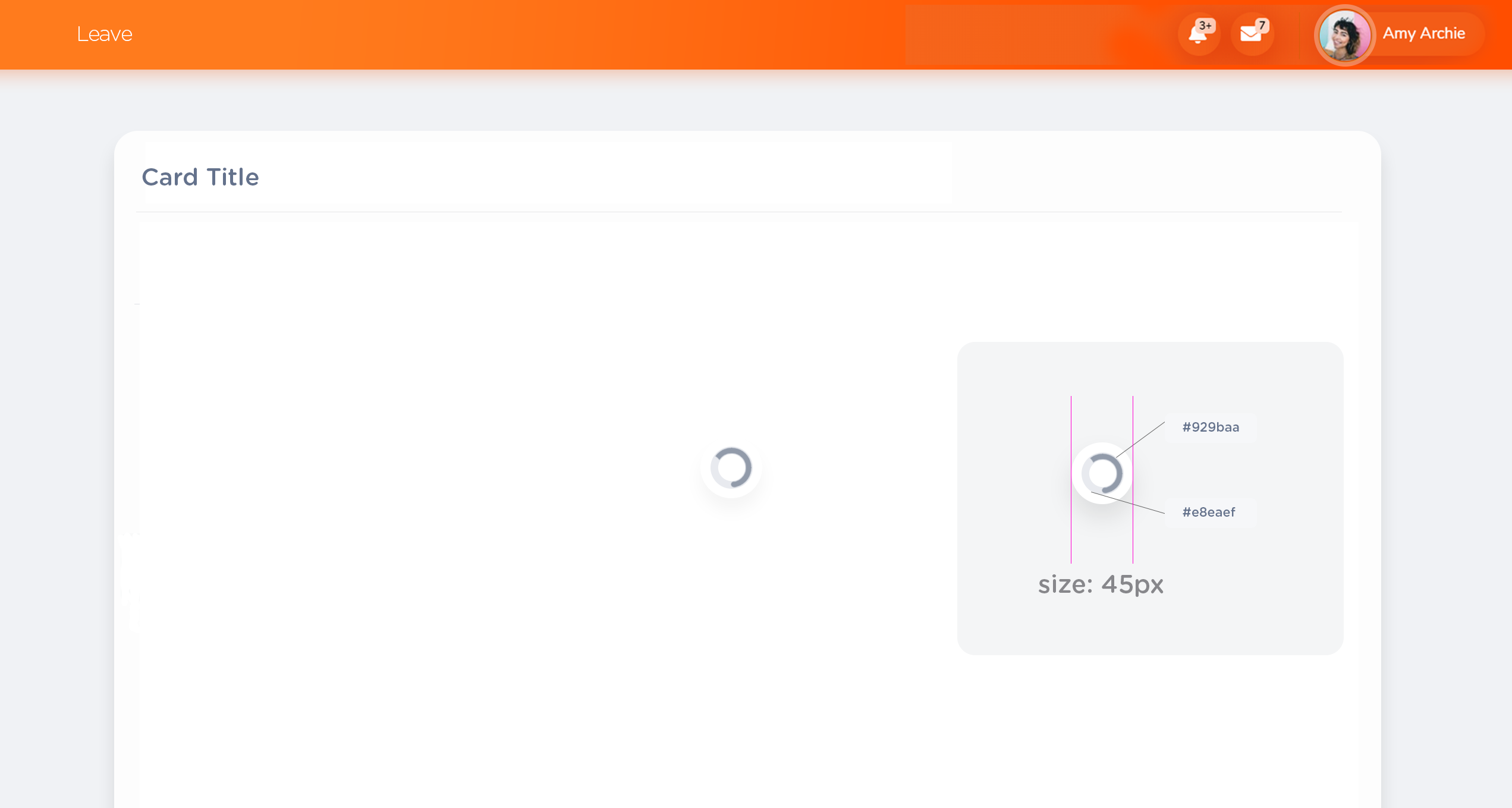
Card Loading Progress
if the loading time take 3 seconds or more than >3 seconds use the progress bar