Design
Guide


Design Thinking revolves around a deep interest in developing an understanding of the people for whom we’re designing the products or services. It helps us observe and develop empathy with the target user. Design Thinking helps us in the process of questioning: questioning the problem, questioning the assumptions, and questioning the implications. Design Thinking is extremely useful in tackling problems that are ill-defined or unknown, by re-framing the problem in human-centric ways, creating many ideas in brainstorming sessions, and adopting a hands-on approach in prototyping and testing. Design Thinking also involves ongoing experimentation: sketching, prototyping, testing, and trying out concepts and ideas.
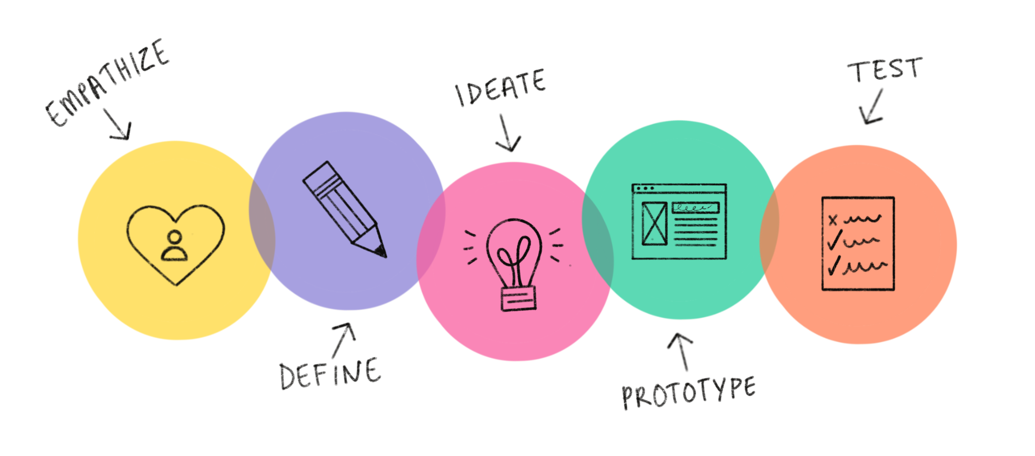
There are many variants of the Design Thinking process in use today, and they have from three to seven phases, stages, or modes. However, all variants of Design Thinking are very similar. All variants of Design Thinking embody the same principles, which were first described by Nobel Prize laureate Herbert Simon in The Sciences of the Artificial in 1969. Here, we will focus on the five-phase model proposed by the Hasso-Plattner Institute of Design at Stanford, which is also known as d.school. We’ve chosen d.school’s approach because they’re at the forefront of applying and teaching Design Thinking. The five phases of Design Thinking, are as follows:
- Empathise – with your users
- Define – your users’ needs, their problem, and your insights
- Ideate – by challenging assumptions and creating ideas for innovative solutions
- Prototype – to start creating solutions
- Test – solutions
It is important to note that the five phases, stages, or modes are not always sequential. They do not have to follow any specific order and can often occur in parallel and repeat iteratively. Given that, you should not understand the phases as a hierarchical or step-by-step process. Instead, you should look at it as an overview of the modes or phases that contribute to an innovative project, rather than sequential steps.
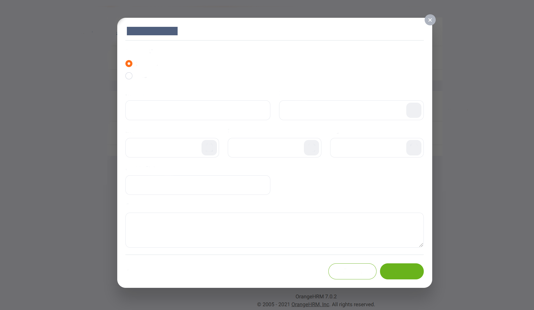 OXD example Visual Hierarchy
Here you can see a removed label OXD form. you can see the difference between the elements and or "shapes", because of the visual differences the user can immediately identify the element very easily, the reason behind this is humans tend to recognize shapes faster than a typo, OXD design this core of this psychology, as for example you can recognize the dropdowns and normal text box without a label, same goes to the button, in here solid green button stand out as the primary button.
Why
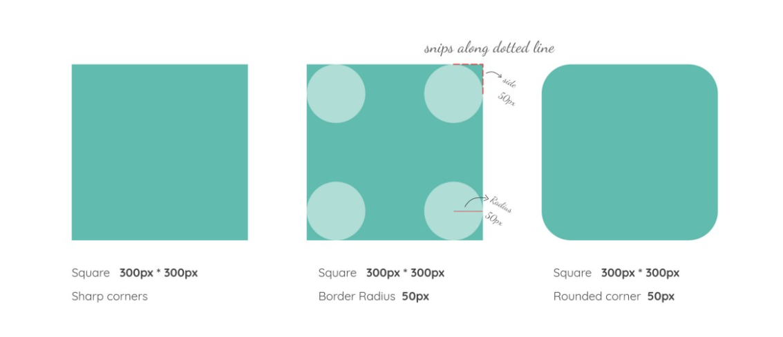
Right off the bat, rounded corners look visually appealing but did you know that there are actual psychological studies to back this theory? This is a classical conditioning principle where our brain is conditioned to think sharp objects can be harmful. A real-life example where sharp corners are considered harmful is when you’re baby-proofing your house by using rounded fittings on sharp table corners. Since the human brain attributes this condition to everything it experiences, rounded corners give off the following vibes — safe, friendly, and hence, approachable. So the human-centered design should incorporate these attributes over the sleek, sharp corners.

Now comes the question of whether to use rounded corners or fully rounded components.
Rounded corners
are perfect for grids,
They help with a friendly interaction
They are space-saving
They draw attention to the content and not the component