Design
Guide
OXD Introduction
Design Thinking
UX Standards
Visual Design
Grid & Layout
Navigations
Componets
 UI Behaviours
 QA Standards
 UI Standards
Buttons
Text-box
Check-box
Radio
Radio Pils
Switch
Search-box
Multi Select
Dropdown
Nested Dropdown
Upload Inputs
Date picker
Time picker
Labels
Help Lable
Status lable
Grupe Input
Grupe Overlay
Comment-box
Paginations
Divider
Progress Circle
Progress Slider
Upload-box
Segments
Tables & List View
Cards & Shaps
Modals & Popups
Advance Componets
Charts
Time picker
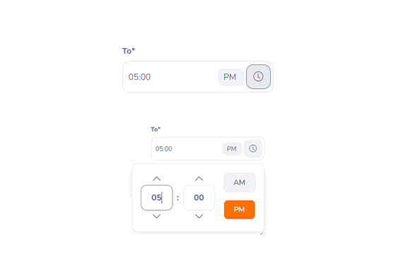
Timeinput picker or slider use to register the time or range of time.
/* timepicker styles */
the outer container is oxd-time-picker

    .oxd-time-picker {
        right: 0;
        display: flex;
        position: absolute;
        align-items: center;
        box-sizing: border-box;
        color: #64728c;
        z-index: 300;
        border: 1px solid #e8eaef;
        box-shadow: 0px 5px 15px -8px rgba(0, 0, 0, 0.15);
        border-radius: 0.65rem;
        background-color: #ffffff;
        max-height: 210px;
        padding: 1rem 1rem;
        width: 250px;
        margin-top: 5px;
    }

Then the hour selection part


    .oxd-time-hour-input {
        display: flex;
        flex-direction: column;
        width: 60px;
        align-items: center;
        color: #64728c;
    }

then the ^ and down icons

    .oxd-icon-button__icon {
        font-size: 18px;
        font-weight: 400;
        color: #64728c;
        cursor: pointer;
    }


The hour / minute input area:

    .oxd-time-hour-input-text {
        box-sizing: border-box;
        font-family: "Nunito", sans-serif;
        color: #64728c;
        line-height: 1.5;
        border-radius: 0.65rem;
        padding: 0.675rem 0.5rem;
        min-height: 45px;
        border: 1px solid #e8eaef;
        width: inherit;
        text-align: center;
        font-size: 1rem;
        font-weight: 700;
    }


The separator

    .oxd-time-separator-icon {
        color: #64728c;
        padding: 0.5rem;
        width: inherit;
        text-align: center;
        font-size: 1rem;
        font-weight: 700;
    }


AM/PM button area

    .oxd-time-period-input {
        color: #64728c;
        display: flex;
        flex-direction: column;
        width: 60px;
        align-items: center;
        justify-content: space-between;
        margin-left: auto;
    }

Selected "AM/PM" button


    display: block;
    text-align: center;
    font-size: 14px;
    font-weight: 600;
    font-family: "Nunito", sans-serif;
    padding: 8px 16px;
    border-radius: 0.5rem;
    border: 1px solid #e8eaef;
    background-color: #ff7b1d;
    color: #ffffff;

button when not selected (eg: PM)

    display: block;
    text-align: center;
    color: #64728c;
    background-color: #f1f2f5;
    font-size: 14px;
    font-weight: 600;
    font-family: "Nunito", sans-serif;
    padding: 8px 16px;
    border-radius: 0.5rem;
    border: 1px solid #e8eaef;

Then the [AM] button in the input field


    box-sizing: border-box;
    margin: 0;
    cursor: pointer;
    font-family: "Nunito", sans-serif;
    font-size: 12px;
    color: #64728c;
    font-weight: 400;
    background-color: #f1f2f5;
    border-radius: 0.4rem;
    padding: 0.25rem 0.5rem;
behavior
Support for themeing , use primery-color1
can use inside the popup or modal