Design
Guide
OXD Introduction
Design Thinking
UX Standards
OXD Introduction
Design Thinking
UX Standards
Visual Design
Grid & Layout
Navigations
Componets
 UI Behaviours
 QA Standards
 UI Standards
Buttons
Text-box
Check-box
Radio
Radio Pils
Switch
Search-box
Multi Select
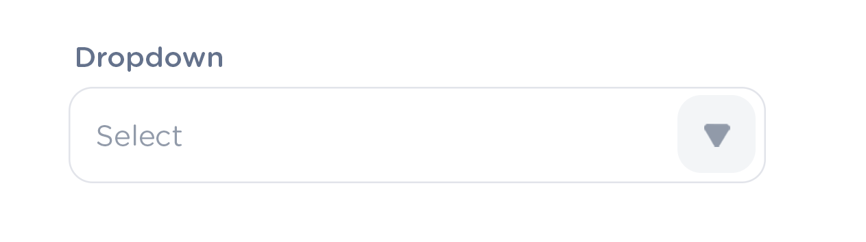
Dropdown
Nested Dropdown
Upload Inputs
Date picker
Time picker
Labels
Help Lable
Status lable
Grupe Input
Grupe Overlay
Scroll-bar
Comment-box
Paginations
Divider
Progress Circle
Progress Slider
Upload-box
Segments
Autocomplete
Tables & List View
Cards & Shaps
Modals & Popups
Advance Componets
Charts
Dropdowns
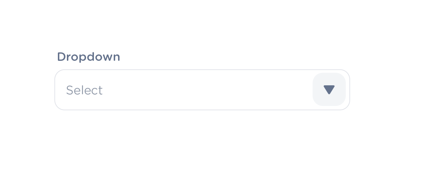
Basic Input Dropdown
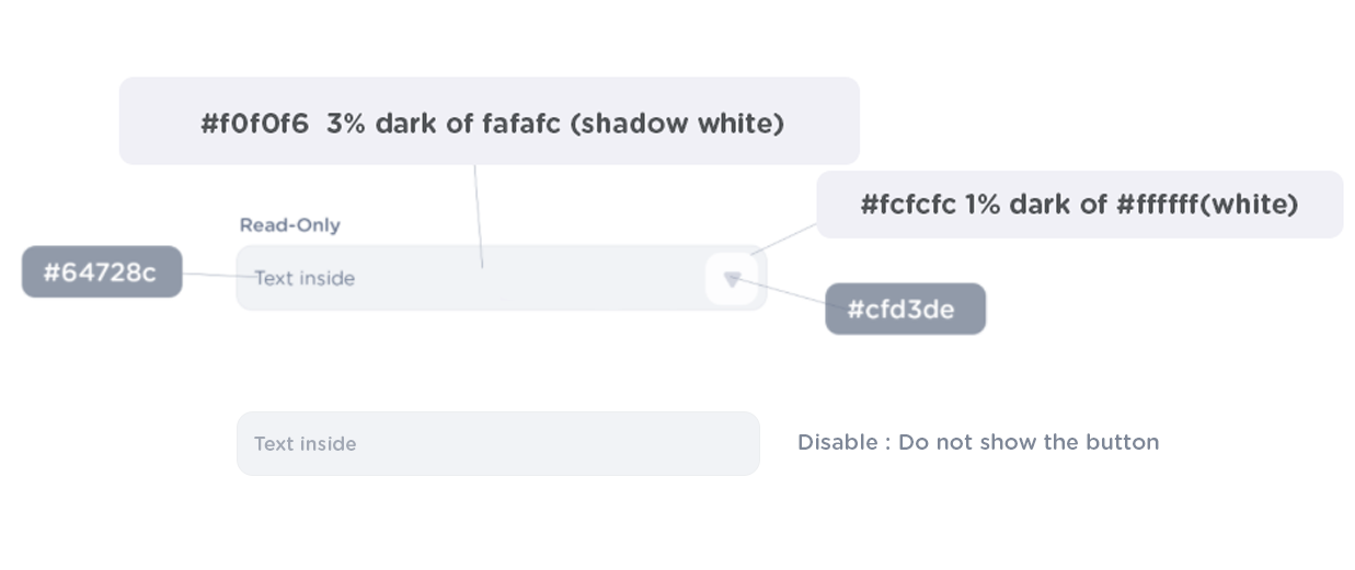
                            font-color : #64728c;
                            border : 1px solid #e8eaef;

                            //Dropdown//
                            font-color : #64728c;
                            background-color : #fff;
                            padding: 4px;
                            box-shadow: 0px 5px 15px -8px rgba(0,0,0,0.15);


                            //Dropdown Separator // border-bottom : 1px solid #fbfbfc;
                            //Dropdown Overlay/hover //
                            background-color : #f6f7f9;
                            border-radius: .65rem;
                            padding 4px;

                            //Dropdown click/active
                            background-color: #e8eaef;
                            border-radius: .65rem;
                            //Dropdown arrow
                            icon: #64728c;

                            //Dropdown fist-option background: active colors
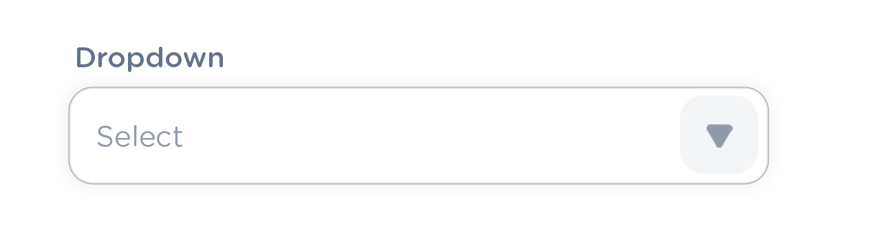
Status
Active
                            font-color : #64728c

                            border : 1px solid #e8eaef

                            //button

                            background-color :#f1f2f5

                            color: #64728c;
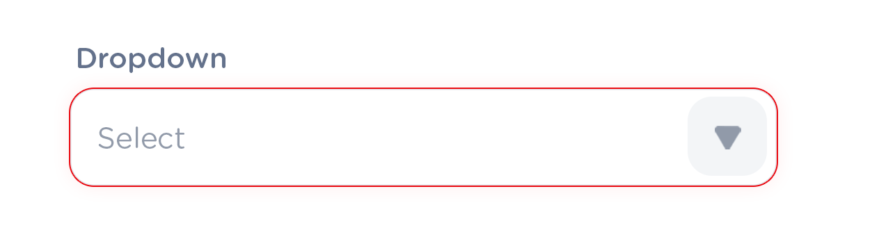
Focus
                            font-color : #64728c

                            border : 1px solid #929baa;

                            box-sadow: 1px 1px 6px rgba(35, 35, 36, 0.12);
Error
                            font-color : #64728c

                            border : 1px solid #eb0910

                            box-sadow: 0 0 5px 0.2rem rgba(223, 9, 16, 0.1)


                            //Error message//

                            font-size: 12px;

                            font-weight: 600;

                            color: #eb0910;

                            margin-top: 4px;
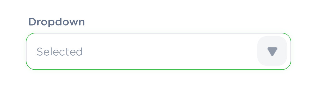
Correct
                            font-color : #64728c

                            border : 1px solid #34bc40

                            box-sadow: 0 0 5px 0.2rem rgba(52, 188, 64, 0.06)
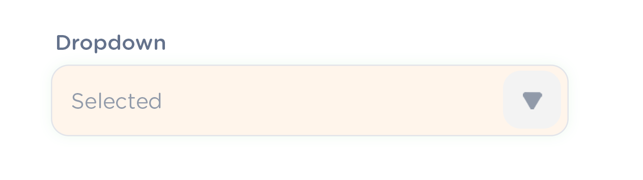
Filled
                            font-color : #64728c

                            border : 1px solid #e8eaef

                            background-color : #fff5eb
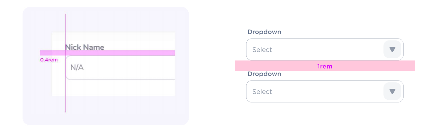
Spacing and Alignment
Behaviors