Design
Guide
OXD Introduction
Design Thinking
UX Standards
Visual Design
Grid & Layout
Navigations
Components
 UI Behaviours
 UI Standards
Buttons
Text-box
Check-box
Radio
Radio Pils
Switch
Search-box
Multi Select
Dropdown
Number Dropdown
Upload Inputs
Upload input box
Date picker
Time picker
Color picker
Labels
Help Lable
Status lable
Group Input
GroupOverlay
Scroll-bar
Count Slider
Text-aria
Comment-box
Paginations
Card loader
Divider
Tables & List View
Cards & Shapes
Modals & Popups
Advance Components
Charts
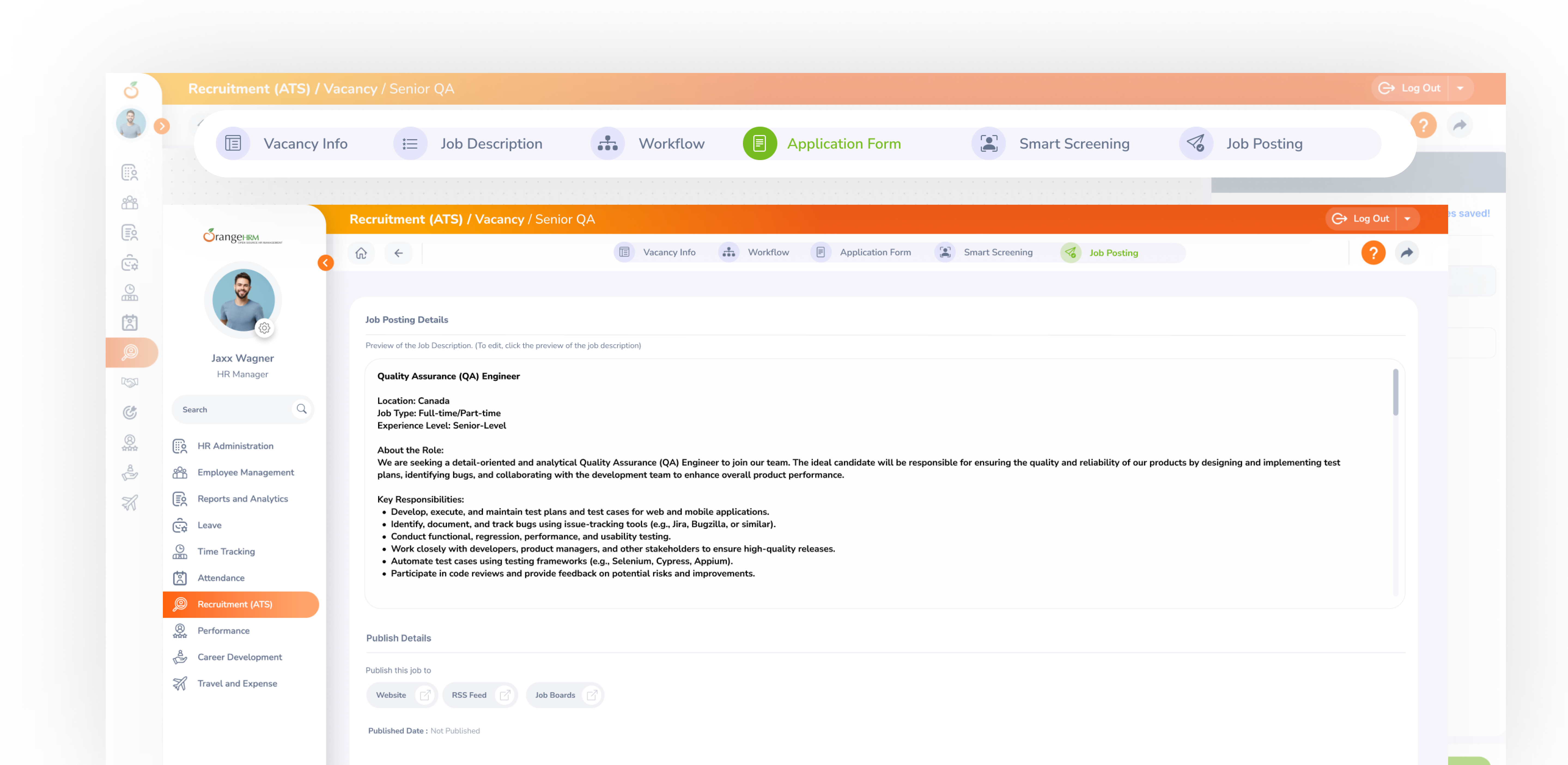
OXD Stepper (Multi-Step Indicator)
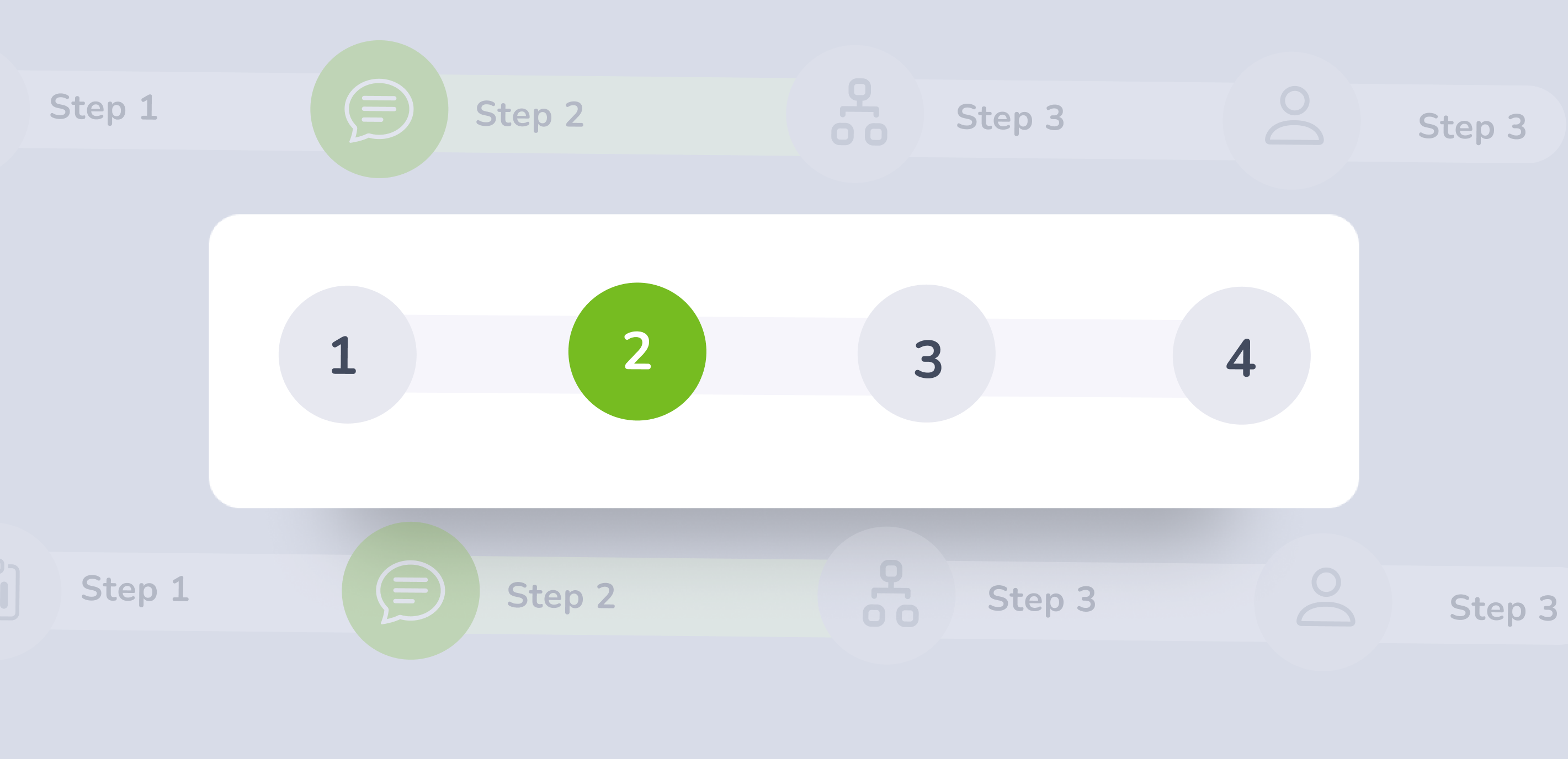
Stepper is a UI component used to divide a process into clearly defined steps
                   .oxd-wizard {
    display: flex;
    align-items: center;
    justify-content: center;
    container-type: inline-size;
    container-name: wizard;

    &-tab {
        display: flex;
        align-items: center;
        background-color: #F6F5FB;
        width: 200px;

        @container wizard (max-width: 1200px) {
            width: 160px;
        }

        @container wizard (max-width: 960px) {
            width: 120px;
        }

        @container wizard (max-width: 720px) {
            width: 100px;

            &:last-child {
                width: 36px;
            }

            .oxd-wizard-tab-title-container {
                display: none;
            }

            .oxd-wizard-tab-circle-tooltip {
                display: block;
                cursor: pointer;

                &.--not-clickable {
                    cursor: default;
                }
            }

            &[tooltip]::before,
            &[tooltip]::after {
                display: none;
            }
        }

        &:first-child {
            border-radius: 20px 0 0 20px;
        }

        &:last-child {
            border-radius: 0 20px 20px 0;
        }

        &-circle {
            display: flex;
            align-items: center;
            justify-content: center;
            min-width: 35px;
            min-height: 35px;
            border-radius: 35px;
            position: relative;

            &-tooltip {
                display: none;
                position: absolute;
                top: 0;
                left: 0;
                width: 100%;
                height: 100%;
            }

            &-button {
                &.--active {
                    color: #F6F5FB;
                    background-color: rgba(118, 188, 33, 0.6);

                    &:hover {
                        color: #F6F5FB;
                        background-color: rgba(118, 188, 33, 0.8);
                    }

                    &:focus {
                        color: #F6F5FB;
                        background-color: rgba(118, 188, 33, 0.9);
                    }
                }

                &:disabled {
                    color: rgba(100, 114, 140, 0.3);
                    background-color: rgba(100, 114, 140, 0.1);
                    cursor: not-allowed;
                    pointer-events: none;
                }

                &.--not-clickable {
                    z-index: 1;
                    cursor: default;
                    pointer-events: none;
                }
            }
        }

        &-title-container {
            transition: width 0.3s;
            margin-left: 10px;
            margin-right: 10px;
            max-width: 100%;
            overflow: hidden;

            &--title {
                width: 100%;
                font-weight: 800;
                font-size: 14px;
                white-space: nowrap;
                overflow: hidden;
                text-overflow: ellipsis;

                &.--active {
                    color: #76BC21;
                }

                &.--disabled {
                    color: rgba(100, 114, 140, 0.3);
                    cursor: not-allowed;
                    pointer-events: none;
                }
            }
        }

    }
}
Stepper Guidelines
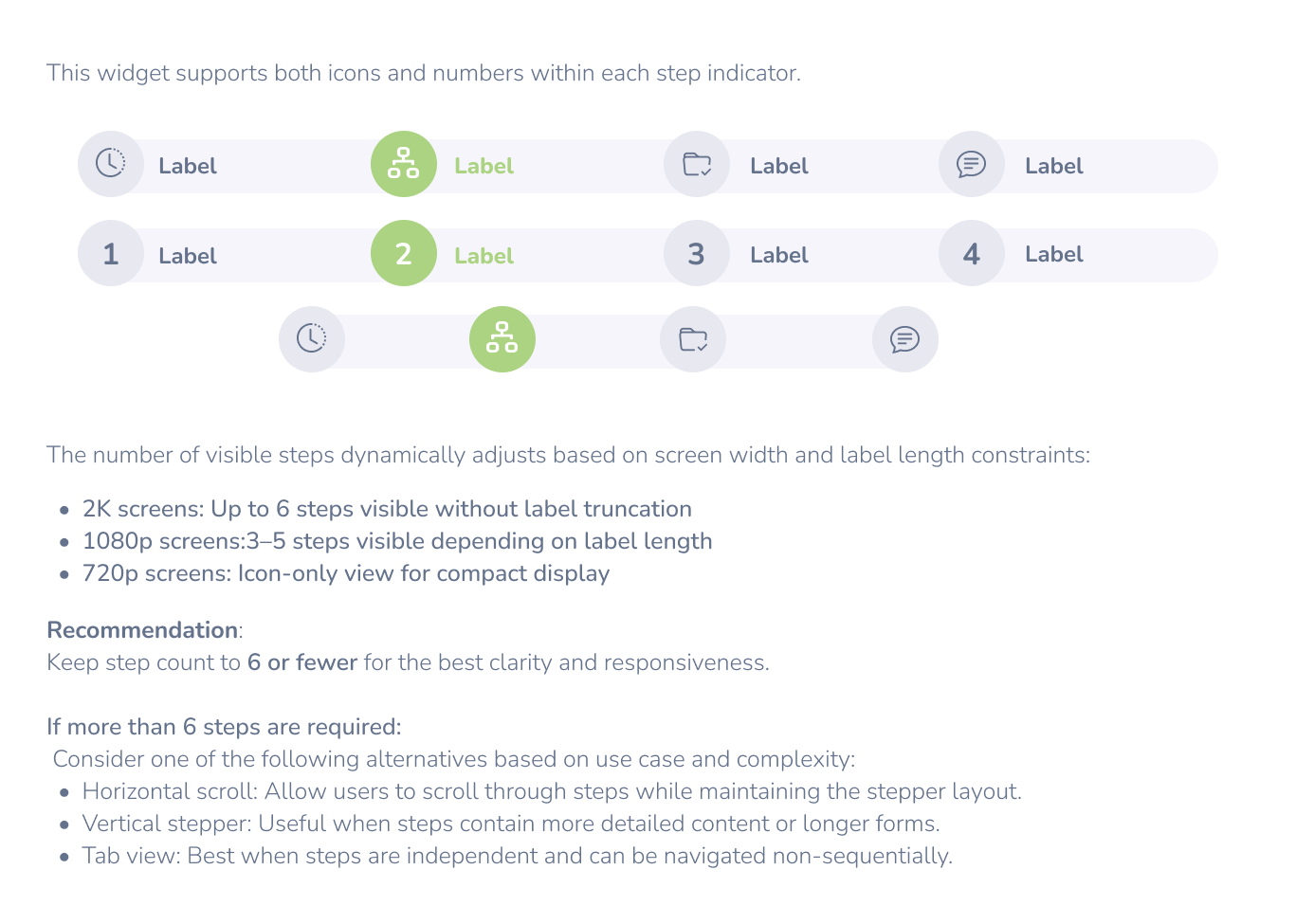
Label Handling
Full Label Mode: Maximum of 20-25 characters.
Truncated Label Mode: If exceeding 20 characters, truncate with ....
Tooltip Support: Hovering over a truncated label should reveal the full text.
If the available width per step is ≤100px, switch to icon-only mode.
Ensure that icon-only mode includes tooltips for accessibility.
When Not to Use
Multi-step processes that require sequential input or actions (e.g., onboarding flow, form wizards, checkout flows).
If users frequently need to jump between steps to compare information — a stepper may make this harder than a flexible layout.
When to UseWhen Not to Use
Behavior & Best Practices