Design
Guide


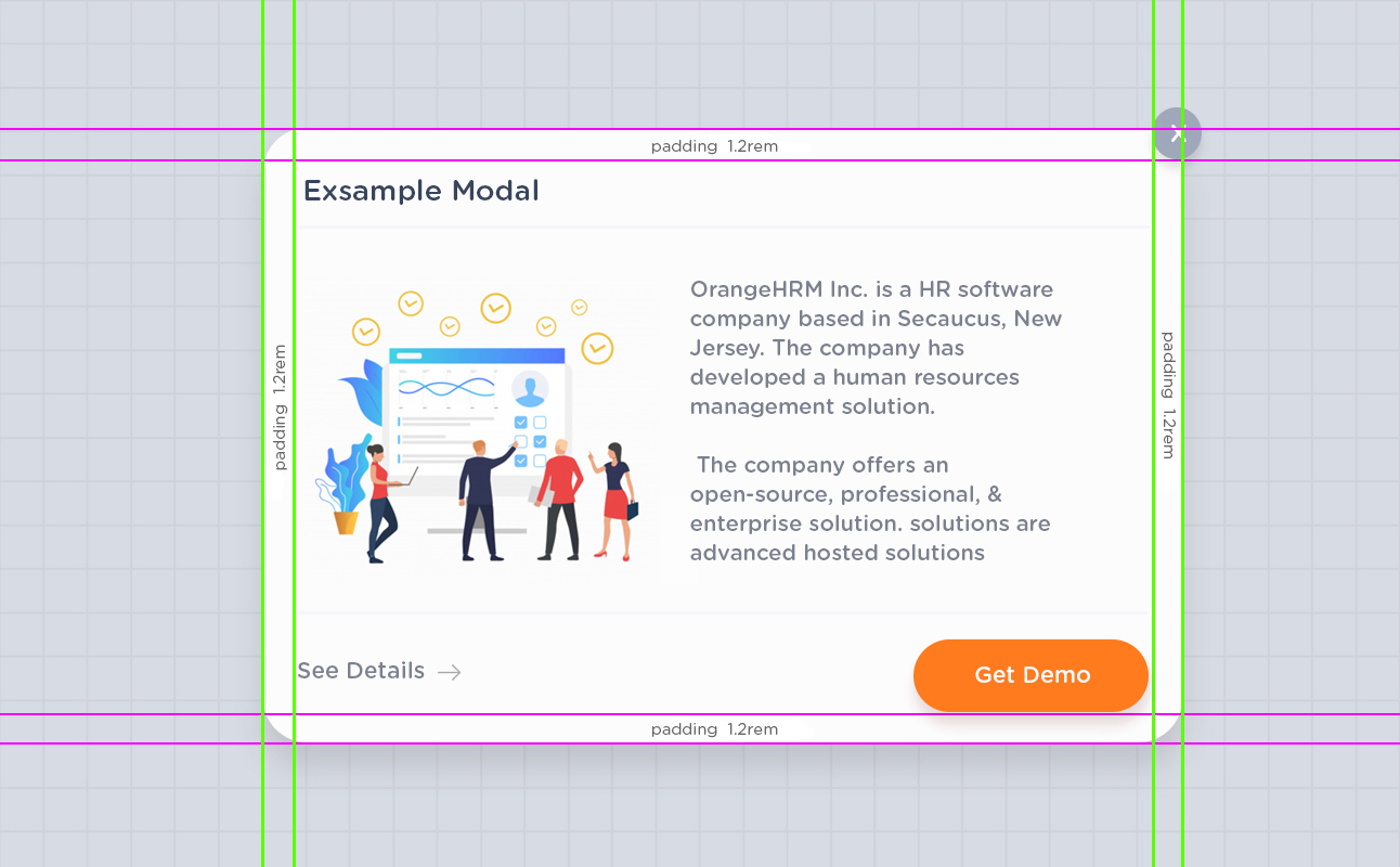
                  .oxd-modal {
                  background-color: #fff;
                  border-radius: 1.2rem;
                  box-shadow: 0px 25px 35px 0 rgba(0, 0, 0, 0.18);
                  padding: 1.2rem;
                  }

                  oxd-modal-close-bt{
                  color: #fff;
                  background-color: #b8bdc7;
                  width: 1.5625rem;
                  height: 1.5625rem;
                  }

                  .oxd-modal title
                  {
                    font-weight: 700;
                    font-size: 1rem;
                    letter-spacing: .15px;
                    color: #64728c;
                  }
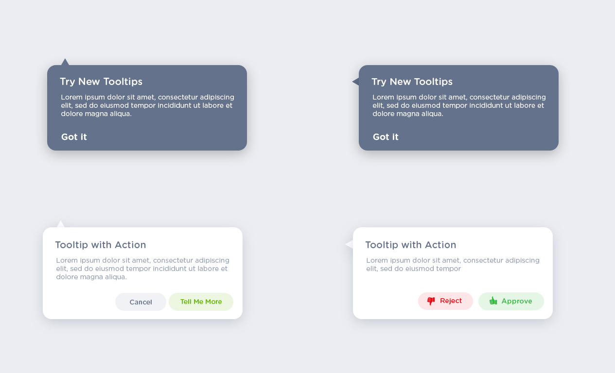
.action-modal{
background-color: #fff;
border-radius: 50px;
min-height: 100px;
padding : 15px;
margin : 25px;
box-shadow: 0px 25px 35px 0 rgba(0, 0, 0, 0.18);
}
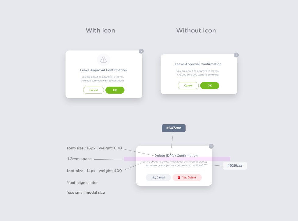
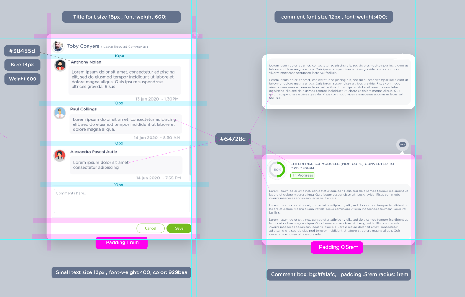
.action-modal .title {
color:#38455d;
font-size: 14px;
font-weight: 600;
padding: 5px;
}
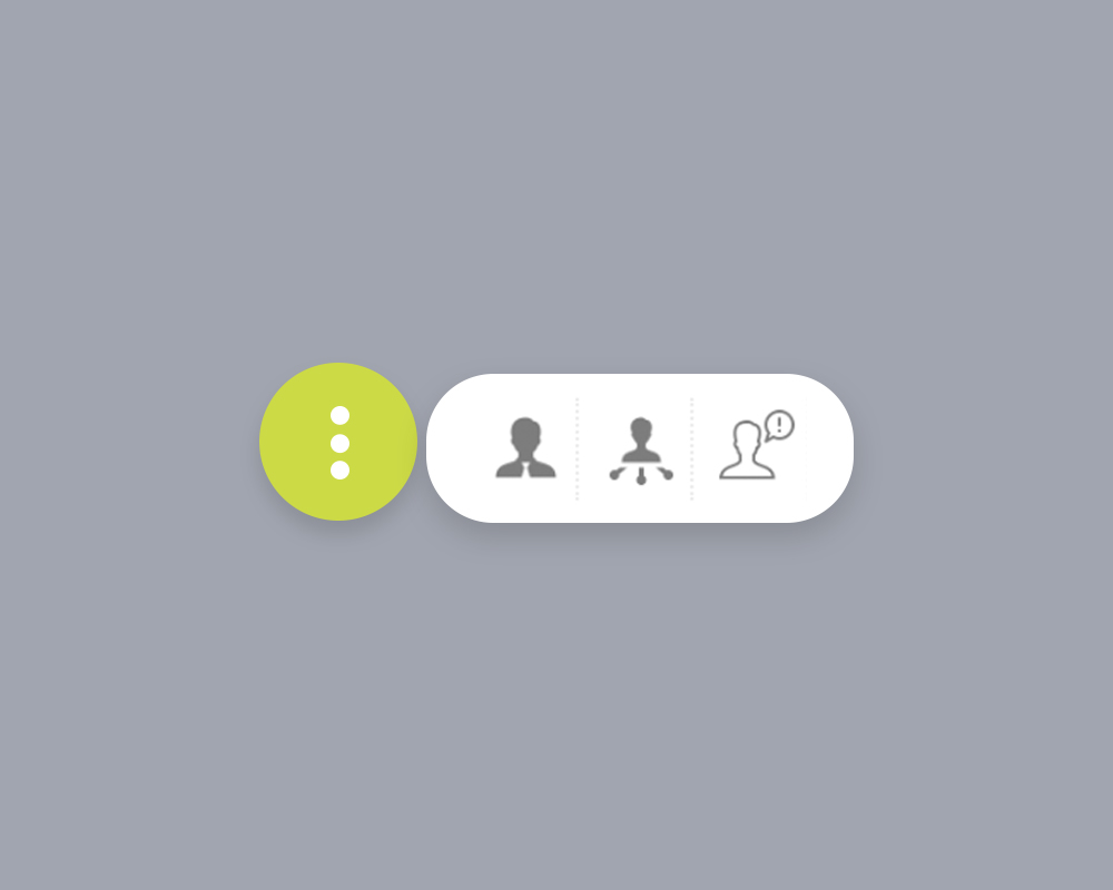
                   .action-modal-small{
                    background-color: #fff;
                    border-radius: 50px;
                    min-height: 60px;
                    padding : 5px;
                    box-shadow: 0px 25px 35px 0 rgba(0, 0, 0, 0.18);
                  }

                  .action-modal-small .icons .li{
                    color:#64728c;
                    font-size: 12px;
                    font-weight: 600;
                  }
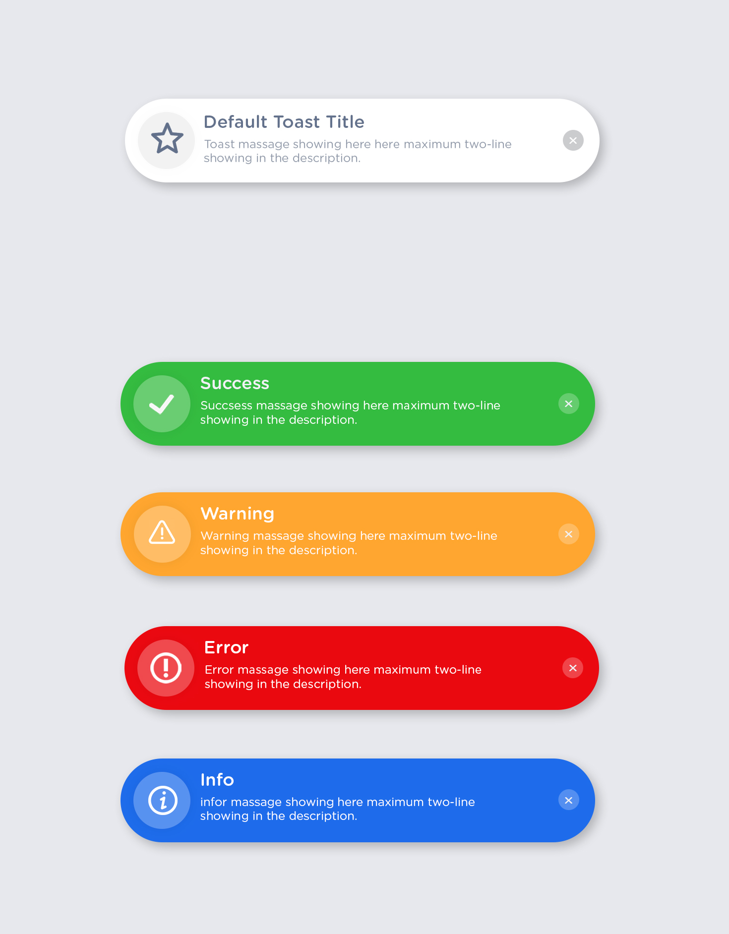
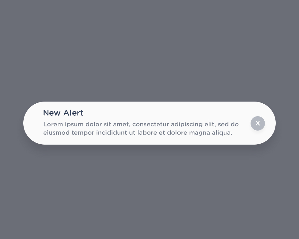
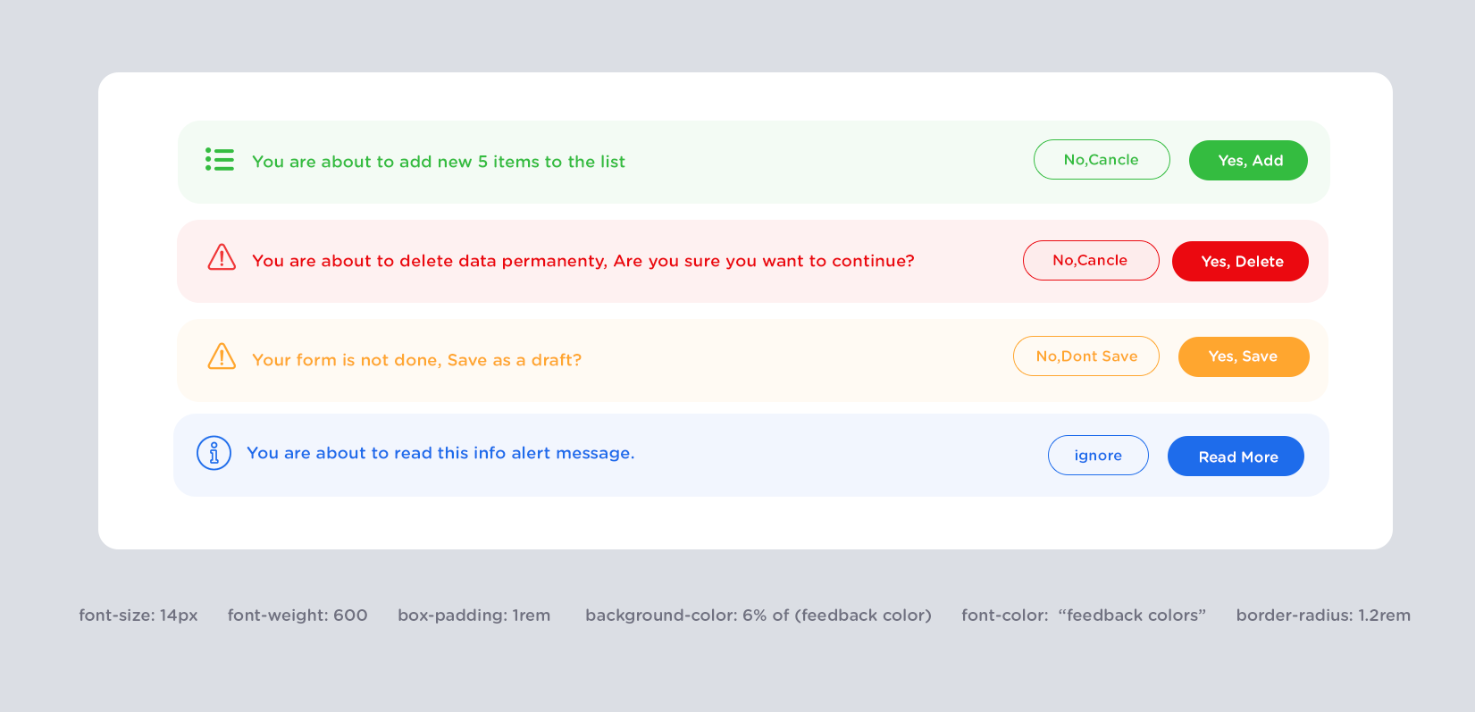
                   .defult-toast-message{
                    background-color: #fff;
                    border-radius: 50px;
                    max-height: 75px;
                    min-width: 400px;
                    padding : 15px;
                    font-size: 14px;
                    box-shadow: 0px 25px 35px 0 rgba(0, 0, 0, 0.18);
                  }
                  .defult-toast-message .title{
                    font-size: 14px;
                    font-weight: 600;
                    color: #64728c;
                  }
                  .defult-toast-messag .icons-wrap{
                    backgorud-color: 10% icon color;
                  }

                  .feedback-toast-messag {
                    backgorud-color: feedback-colors;
                    color: #fff;
                    padding :5px
                  }
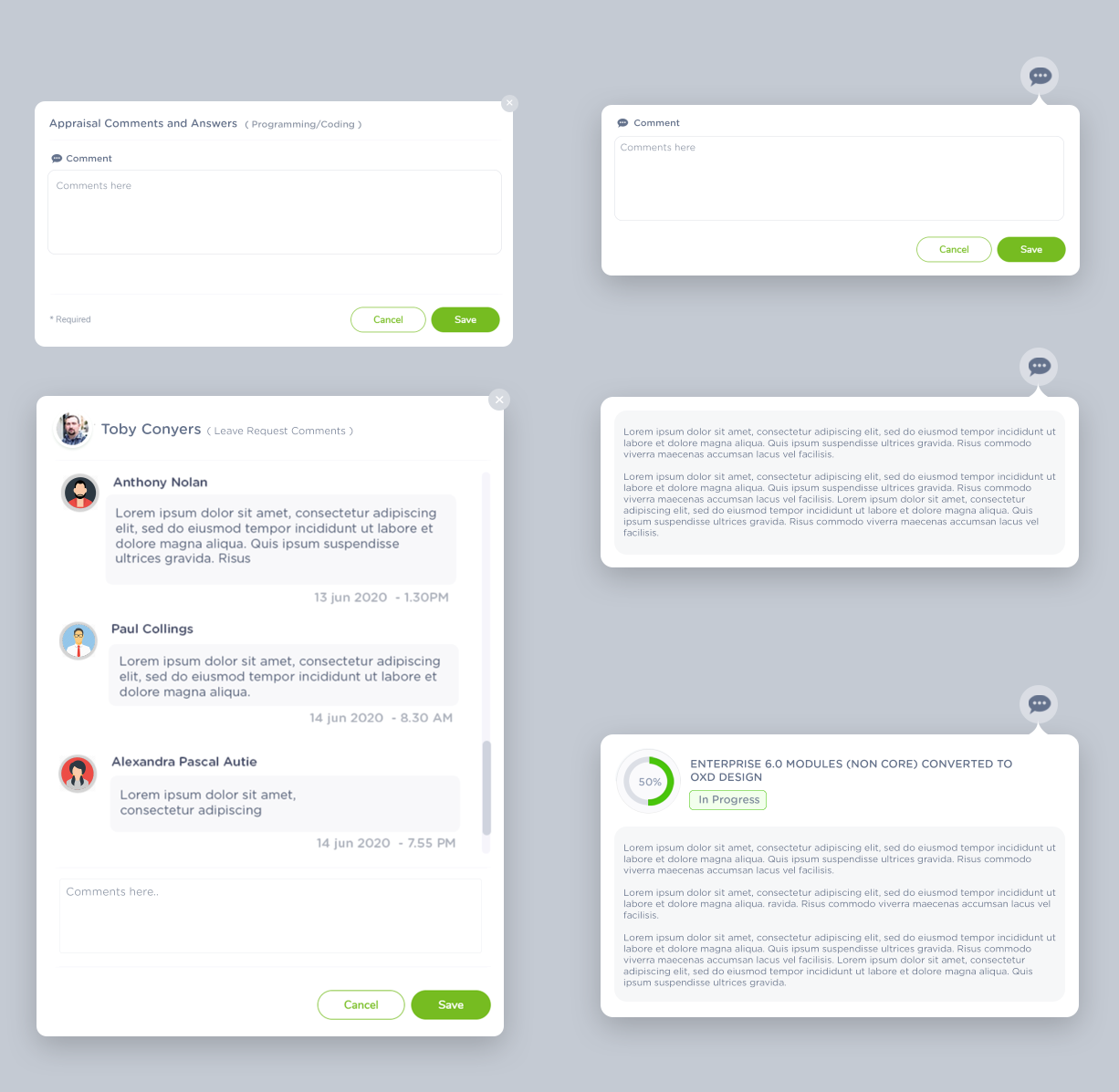
Toast message should appear after the content/list is fully loaded or somecase on loading(infinity scroll page)
Toast message should not contain more than 3 lines, its should able to read under 5 seconds, more than that is not recommended use conformation alert instead
Toast message with action should not disappear until user click on the action or cancel the action
Toast message max width should be 400px or 35% of the screen width, shoudl not be more than that.
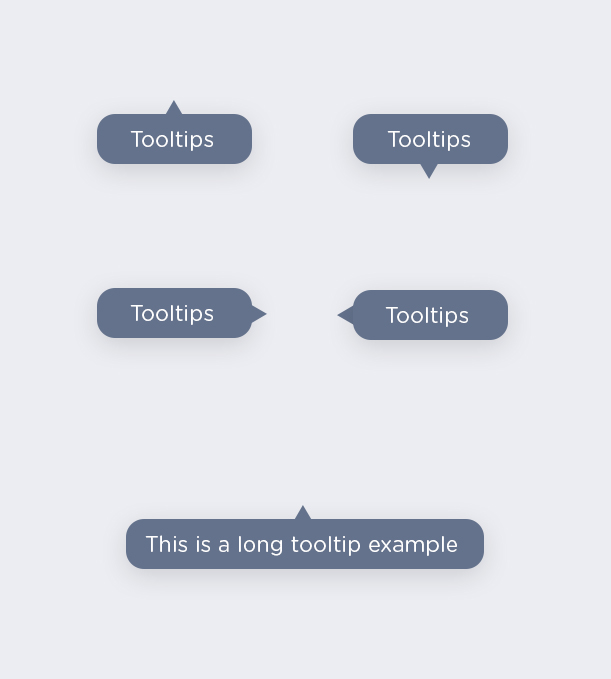
                   .tooltips{
                    background-color: #64728c;
                    color:#fff;
                    border-radius: 18px;
                    box-shadow: 0px 25px 25px 0 rgba(0, 0, 0, 0.18);
                  }
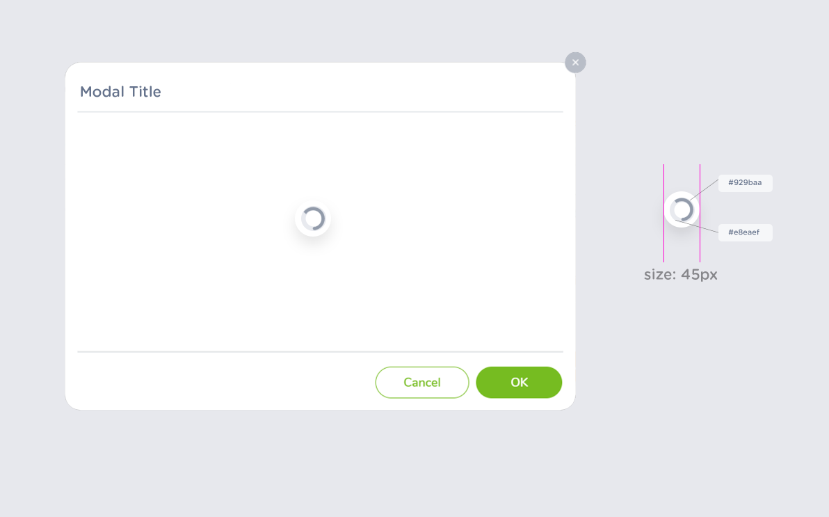
min-height : the modal loader-body will be 300px for medium modal, 300px< or more for large modals, for samll or one text-box modal use 150px as min height
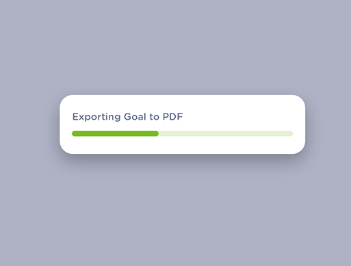
                   .progress-bar-lite{
                    background-color :#76bc21;
                    size: 8px;
                    border-radius:50%
                  }
                  .background-bar
                  {
                     backgorund-color: #76bc21- 6%
                     border-radius:50%
                     size: 8px;
                     width:100%;
                  }
                  .popup
                    box-shadow: 0px 25px 35px 0 rgba(0, 0, 0, 0.18);
                  }

                  .popup title
                  {
                    color: #64728c;
                    font-weight: 700;
                    font-size: 16px;
                  }
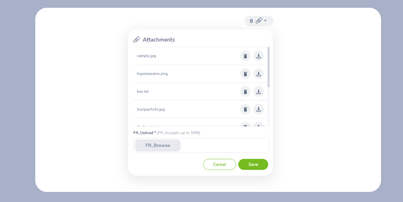
The modal width should adjust based on the content and inputs within it. For example:
- Single column input / One text-box input - Small Size Modal (min height: 150px)
- Two column input - Medium Size Modal (min height: 300px)
- Three column input - Large Size Modal (min height: 300px or more)
Note: The width of the modal will be determined by the number of columns, components, and the input value length of each component used in the modal. Input sizes may vary due to text limits, component types, etc.