Design
Guide


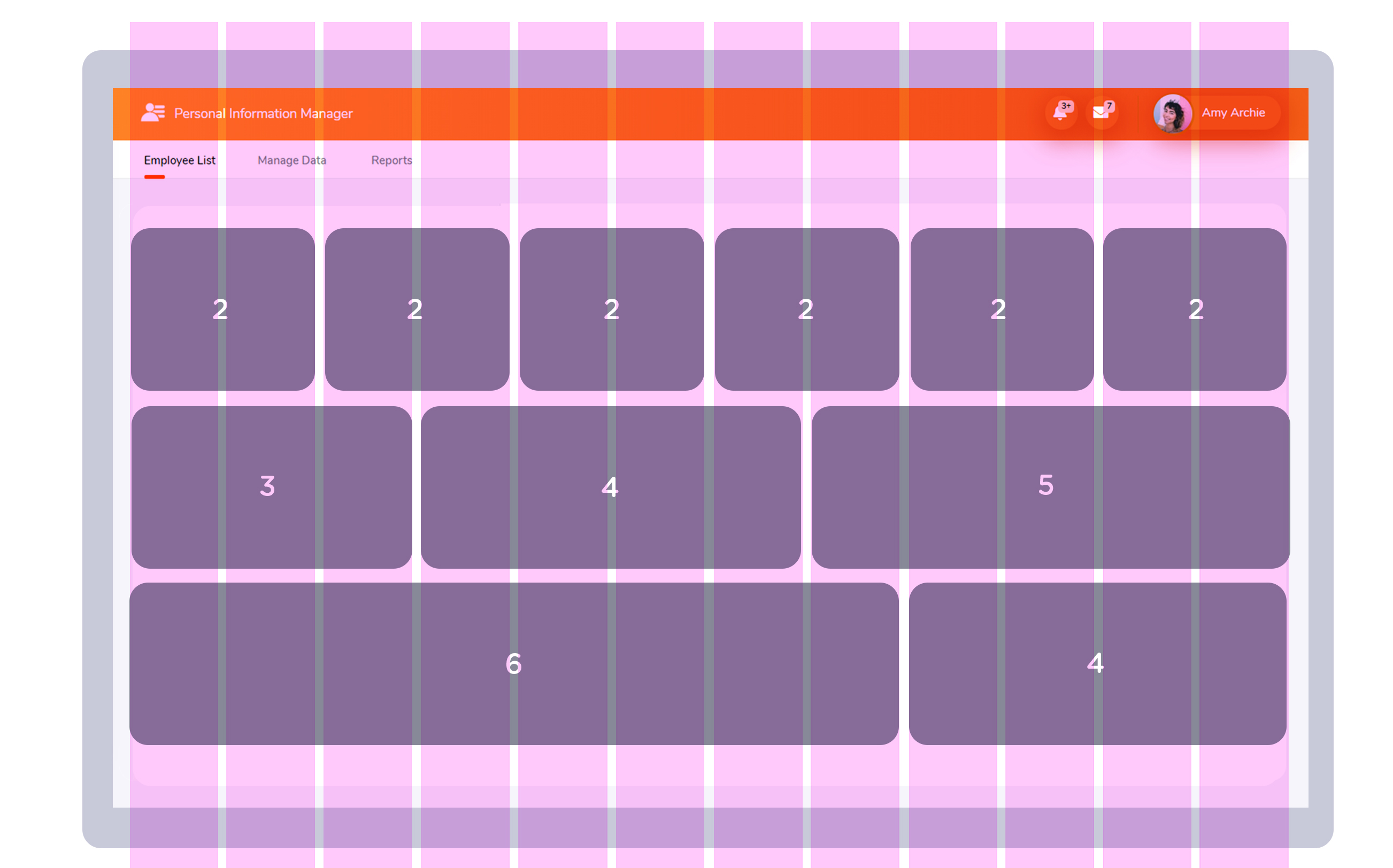
The grid system of Bootstrap allows you to divide a row into 12 columns of equal width. However, these columns can also be combined to create columns that are wider and positioned differently. The grid can also be responsive and rearrange depending on the screen width or window size.
For example, you may want to display a three column layout on a computer screen. However, this can become difficult to view on a smaller screen, so you can make it to a single column grid with three columns stacked on top of one another. This can be done by assigning the appropriate responsive class to a column.
There are five classes in Bootstrap 4 which define the responsiveness of the grid element:
To understand how the Bootstrap grid system is used, you must know the rules by which it functions:
- To create horizontal groups of elements, you have to create a .row class first. For the proper alignment and padding, these should be placed into .container or .container-fluid containers.
- Content is placed in columns that are placed in rows. Only columns should be direct children of .row containers.
- The columns create gaps between each other that are referred to as gutters. They are offset as negative margin in the first and last columns of the row. The gutters are typically 15px wide on both sides of the column.
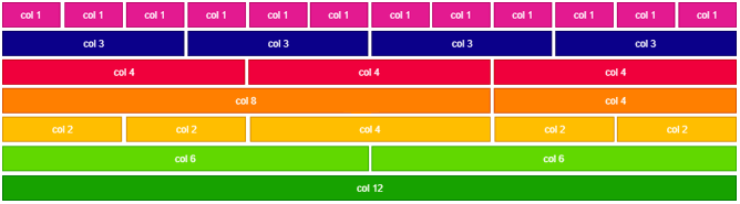
- You can create grid columns by specifying how many of the 12 available columns they should span.
- Column widths are all percentage values. This keeps them responsive and fluid.
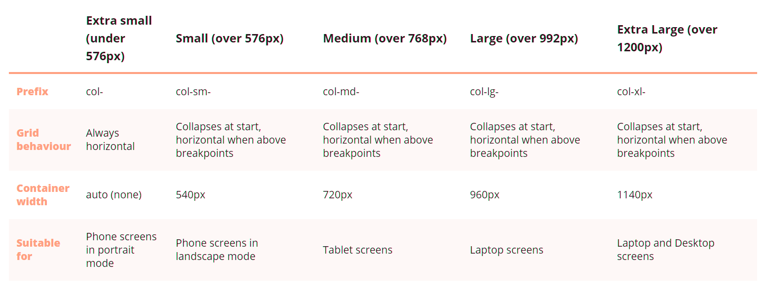
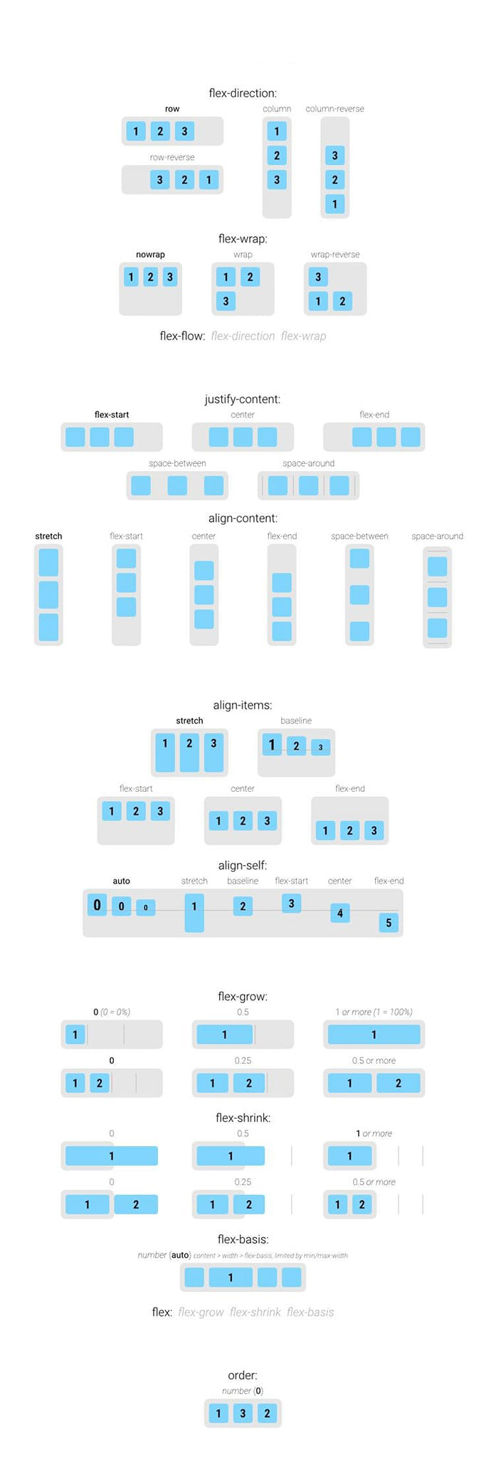
Using the following table, you can easily check out the different layout building solutions that the Boostrap grid system offers: or you can use flex as below