Design
Guide


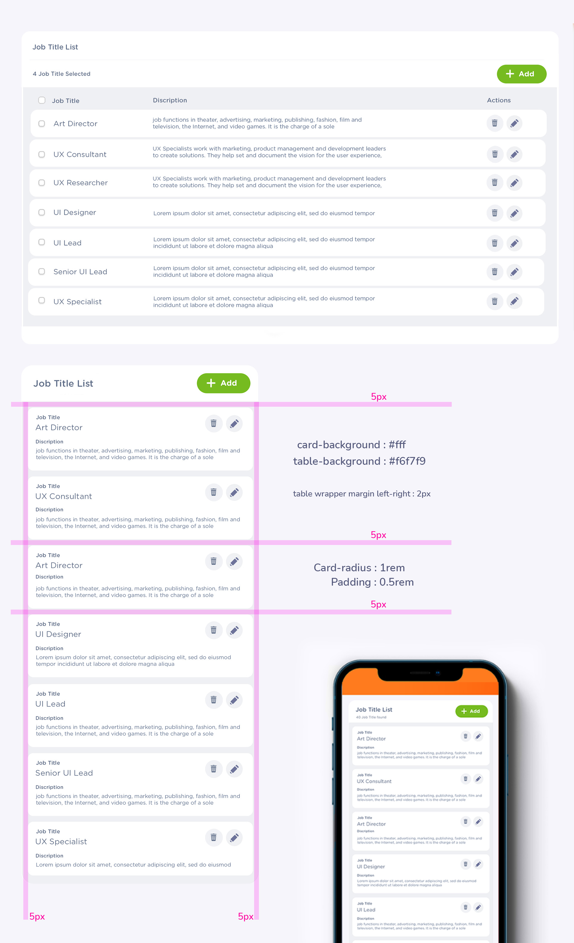
                    .List-card {
                    background-color: #fff;
                    border: 1px solid #f5f5f5;
                    border-radius: 1.2rem;
                    font-size: 12px; //defult
                    font-weight: 500; //defult
                    color: #64728c; //defult
                    min-height: 45px;
                    padding: 5px;
                    marign-top: 5px;
                  }
                    .list-card title  {
                    background-color: #fff;
                    border-bottom: 1px solid #f5f5f5;
                    color:#64728c;
                    font-size: 14px;
                    font-weight: 800;
                    min-height: 40px;
                    padding: 5px;
                  }
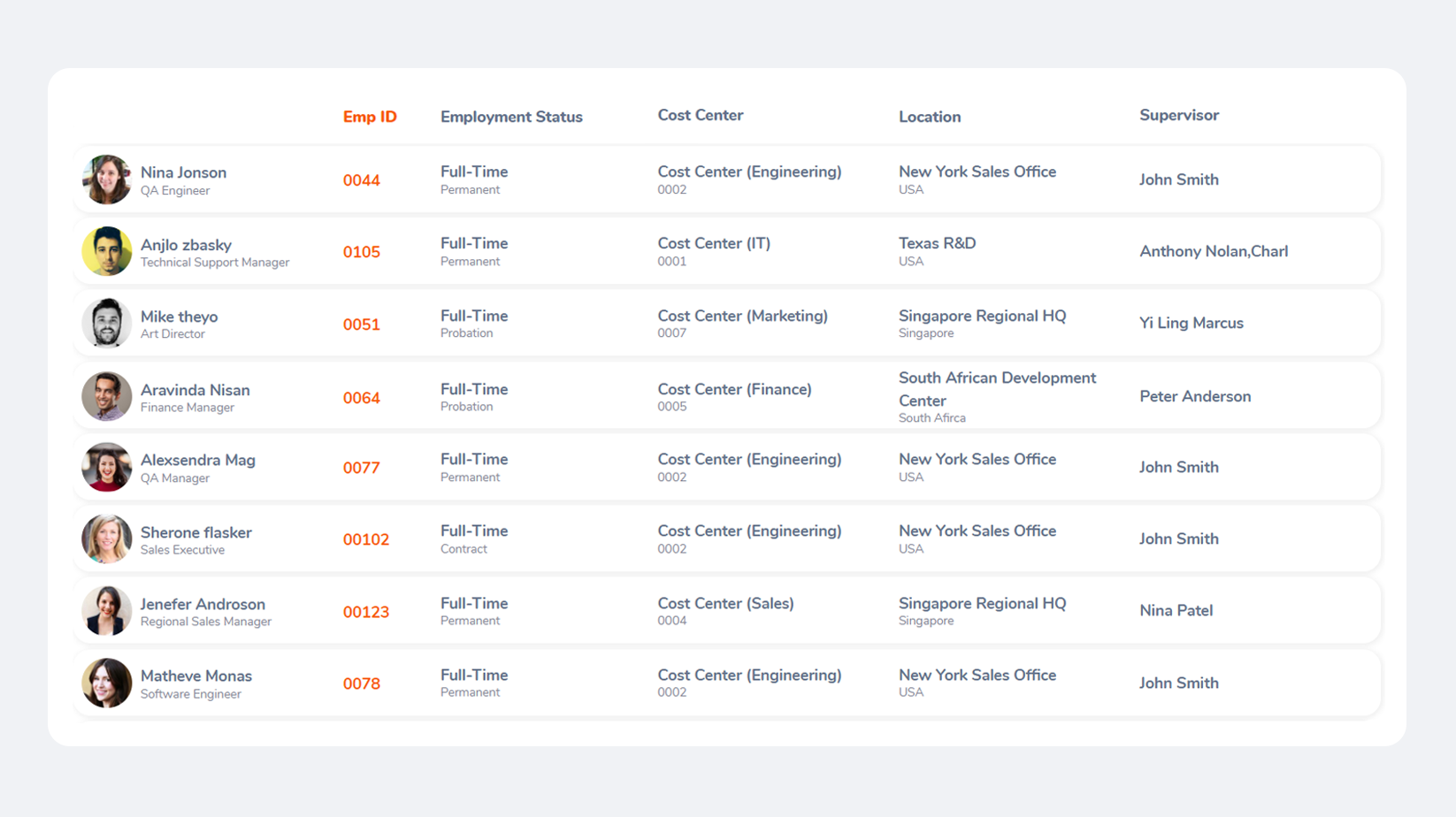
                    .List-view {
                    background-color: #fff;
                    border-bottom: 1px solid rgba(56, 69, 93, 0.06);
                    font-size: 12px; //defult
                    font-weight: 500; //defult
                    color: #64728c; //defult
                    min-height: 40px;
                    padding: 5px;
                  }
                    .list-view title  {
                    background-color: #fff;
                    color:#64728c;
                    font-size: 14px;
                    font-weight: 800;
                    min-height: 40px;
                  }
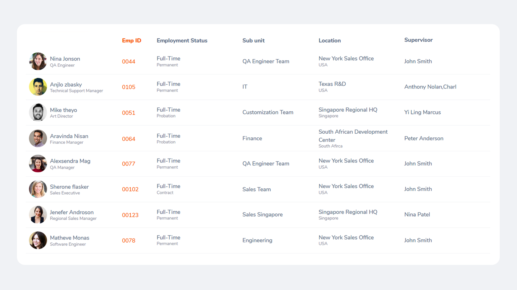
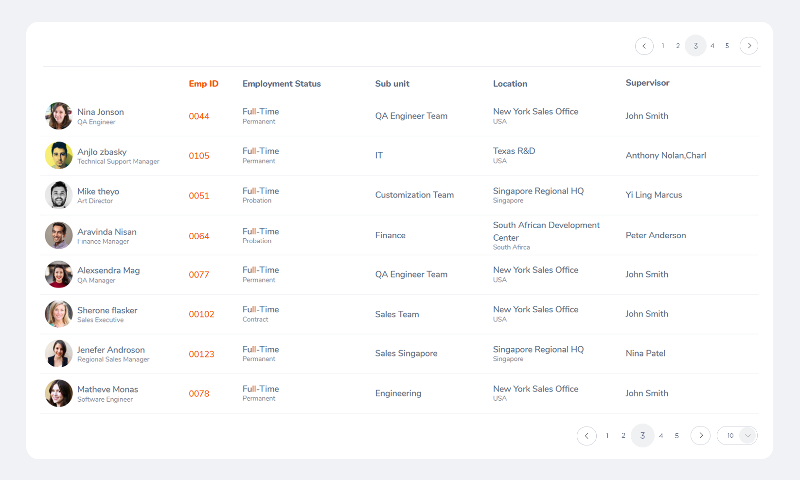
| # | First | Last | Job Title |
|---|---|---|---|
| 1 | Aravinda | Nisan | Technical Support Manager |
| 2 | Mike | theyo | Art Director |
| 3 | Larry | hadsone | Software Engineer |
| 4 | Alexsendra | Mag | QA Managerr |
                   table td, .table th {
                    padding: .65rem;
                    vertical-align: top;
                    border-top: 1px solid #e8eaef;
                    color: #64728c;
                    font-size: 12px //defult
                   }
                   .table thead th {
                        border-bottom: 2px solid #dee2e6;
                        font-size: 12px; //defult
                        font-weight: 700;
                      }
| # | First | Last | Job Title |
|---|---|---|---|
| 1 | Aravinda | Nisan | Technical Support Manager |
| 2 | Mike | theyo | Art Director |
| 3 | Larry | hadsone | Software Engineer |
| 4 | Alexsendra | Mag | QA Managerr |
.table-striped tbody tr:nth-of-type(odd) { background-color: #fafafc; }
| # | First | Last | Job Title |
|---|---|---|---|
| 1 | Aravinda | Nisan | Technical Support Manager |
| 2 | Mike | theyo | Art Director |
| 3 | Larry | hadsone | Software Engineer |
| 4 | Alexsendra | Mag | QA Managerr |
                      .table-hover tbody tr:hover {
                              color: #38455d;
                              background-color: #F1F2F5;
                          }
| First | Last | Job Title |
|---|---|---|
| Aravinda | Nisan | Technical Support Manager |
| Mike | theyo | Art Director |
| Larry | hadsone | Software Engineer |
| Alexsendra | Mag | QA Managerr | Harry | Style | QA Managerr |
                      .table .new tr{
                              background-color: #f5fded;
                          }
*Newly added items to the list-view will be highlited with this color, highlight will disappear when list reload
*This new Item will appear on the top of the list always despite the sorting order, until list get refresh
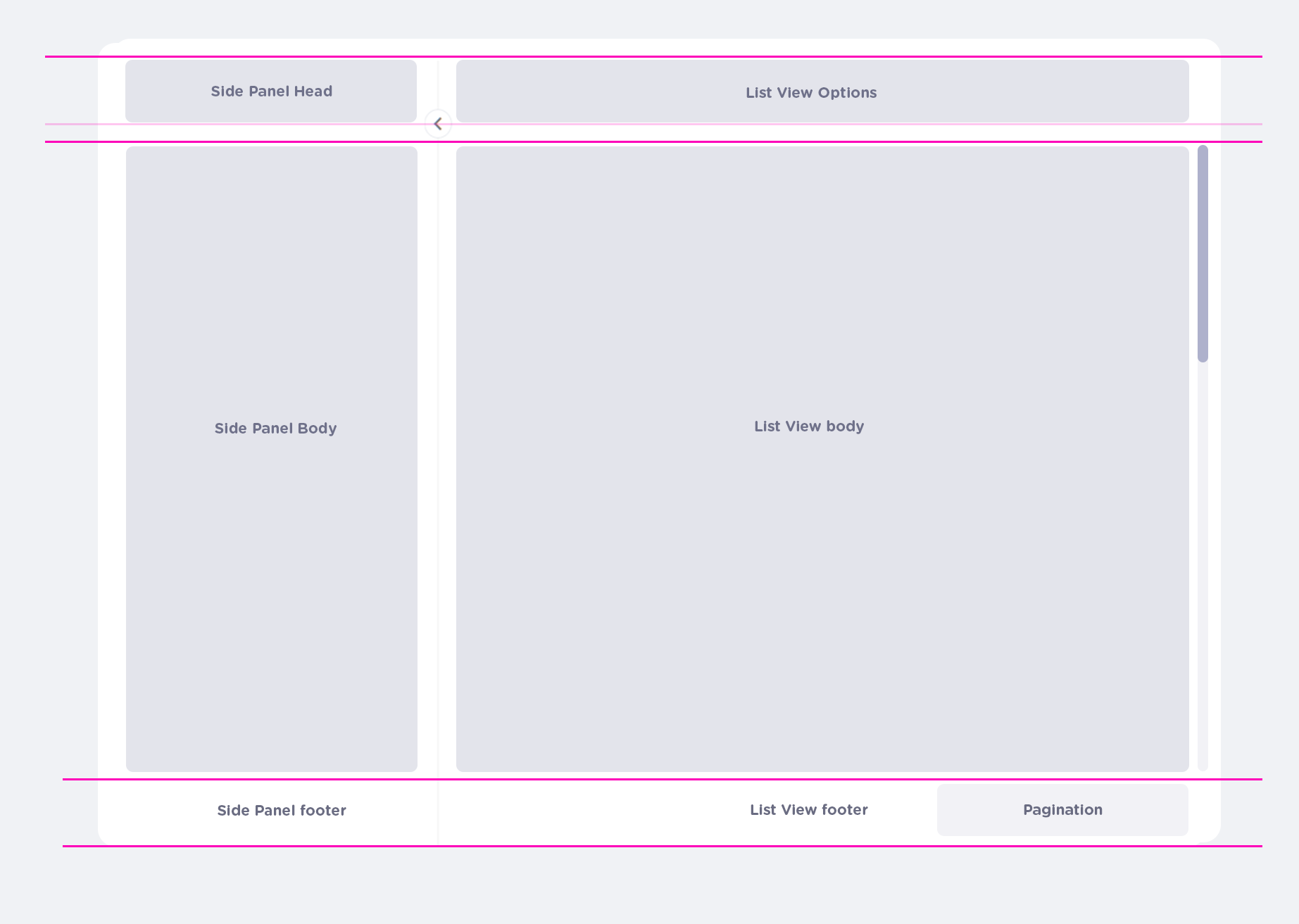
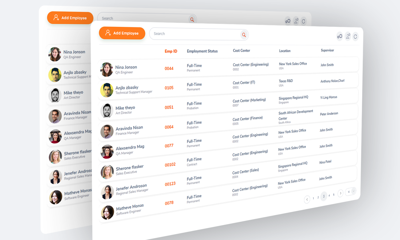
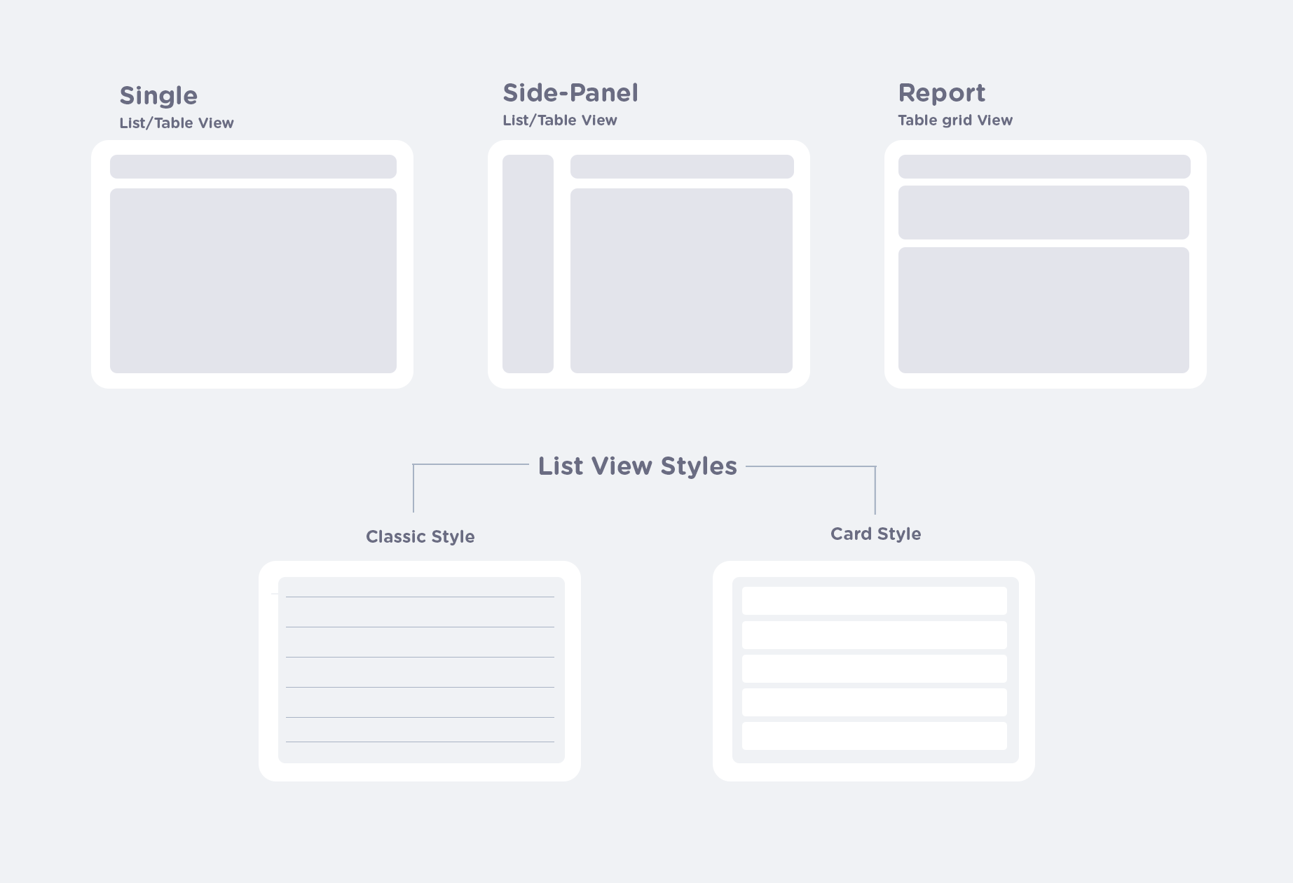
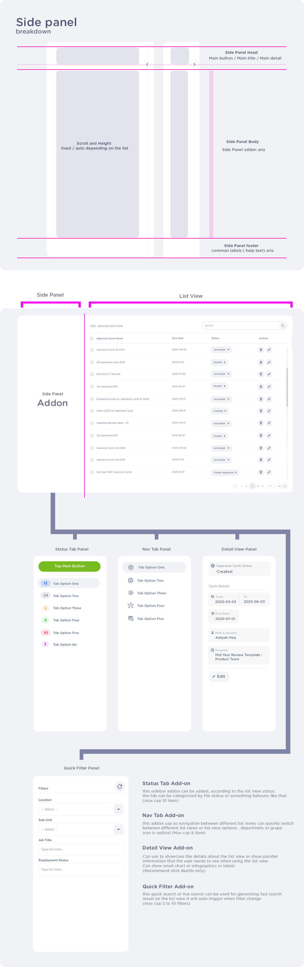
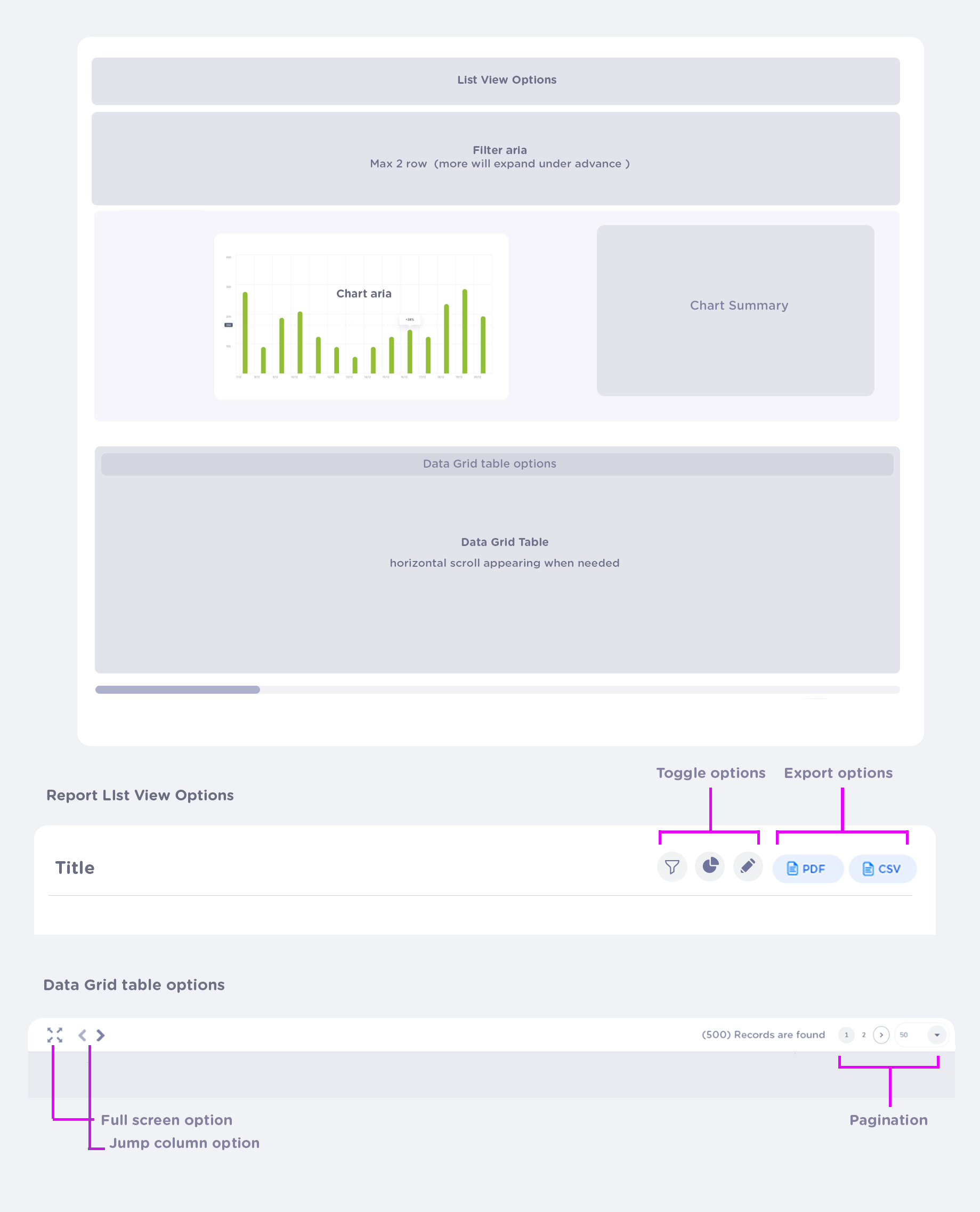
*In here indicated the structure of the two-panel List/Table view
list/table will use OXD inside scrolling bar, footer will be fixed to the screen.
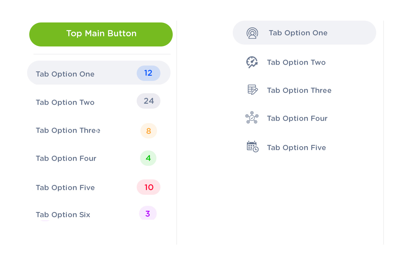
                    .oxd.left-panel .tab{
                    text-align: left;
                    color: #64728c;
                    font-size: 12px
                    font-weight: 600;
                    border-radius: 2.5rem;
                    padding: .5rem 8px;
                    width: 100%;
                    margin-bottom:5px;
                  }

                  .oxd.left-panel .tab hover{
                    background color:#f1f2f5;
                  }

                  .oxd.left-panel .tab .active{
                    background color:#f1f2f5;
                    font-weight: 700;
                  }
                    .tab-number-batch{
                      border-radius: 35%;
                      width: auto;
                      padding-left: 5px;
                      padding-right: 5px;
                      background-color: 10% of font-color;
                      color:"status colors";
                    }

                    .tab-icon{
                      color: #64728c;
                    }

                    tab.buttons{
                      width: 100%;
                    }
                    .oxd-slid-toggle-button {
                      position: absolute;
                      background: #fff;
                      border-radius: 50%;
                      font-size: 20px;
                      border: 1px solid #e8eaef;
                      cursor: pointer;
                  }

                  OXD seperator {
                    1px solid  #efefef
                  }
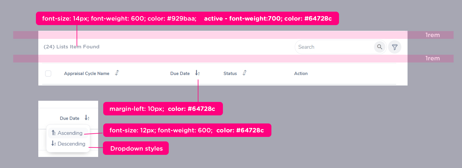
In OXD Sorting in listview will be preserved by default. When navigating to other tabs,another screen or modul. however it will be reset with browser refresh button also when logout
.oxd-report-tables td {
font-size: 12px; //defult
font-weight: 600; //defult
color: #64728c; //defult
}
oxd-report-spatial-td{
background-color: 6% of text
font-color: any color defined from statues
}
oxd .floating-horizontal-scroll-button {
color: #fff;
background-color: #ff7b1d;
border-radius: 50%;
padding: .35rem;
cursor: pointer;
}
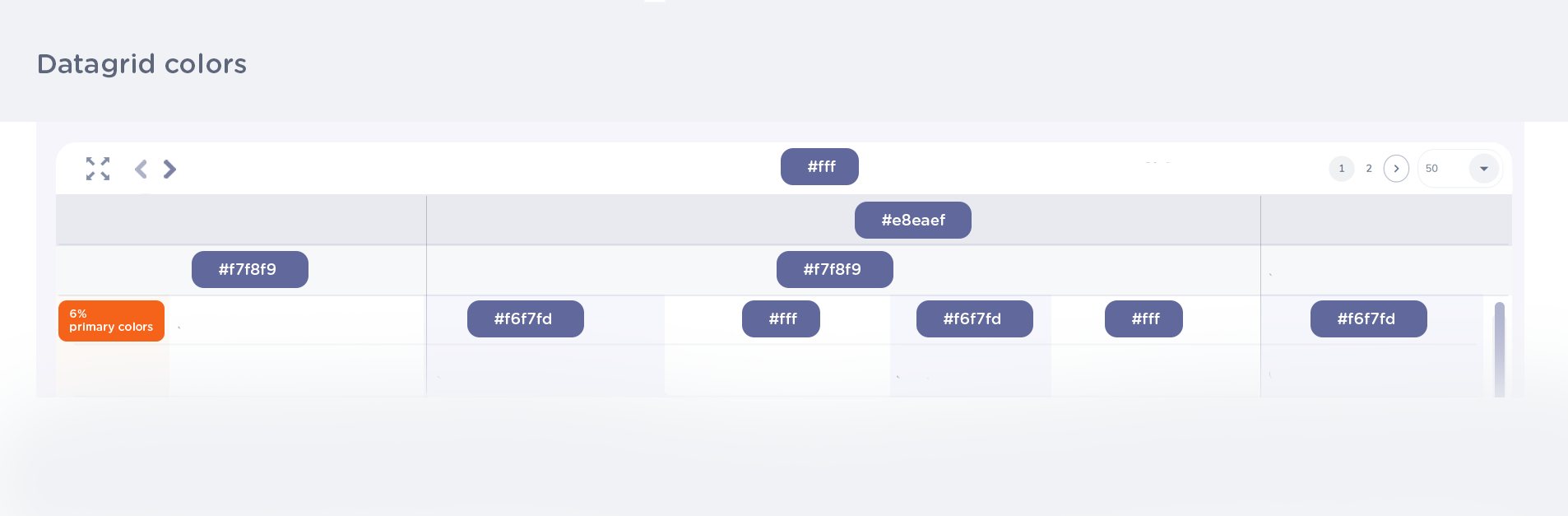
.oxd-report-tables column strips odd{
background-color:#f6f7fd
}
.oxd-report-tables eid column {
background-color: 6% of primary colors
}
                    .oxd-report-tables title  {
                    background-color: #f7f8f9;
                    color:#38455d;
                    font-size: 14px;
                    font-weight: 800;
                    min-height: 40px;
                    max-height:100px
                  }

                  .oxd-report-tables catgorty title {
                  background-color: #e8eaef;
                  color:#38455d;
                  font-size: 14px;
                  font-weight: 800;
                  min-height: 40px;
                  max-height:100px;
                }

                .oxd-report-tables custom color column{
                  font-color: custom colors;
                  background: 6% of custom colors;
                 }
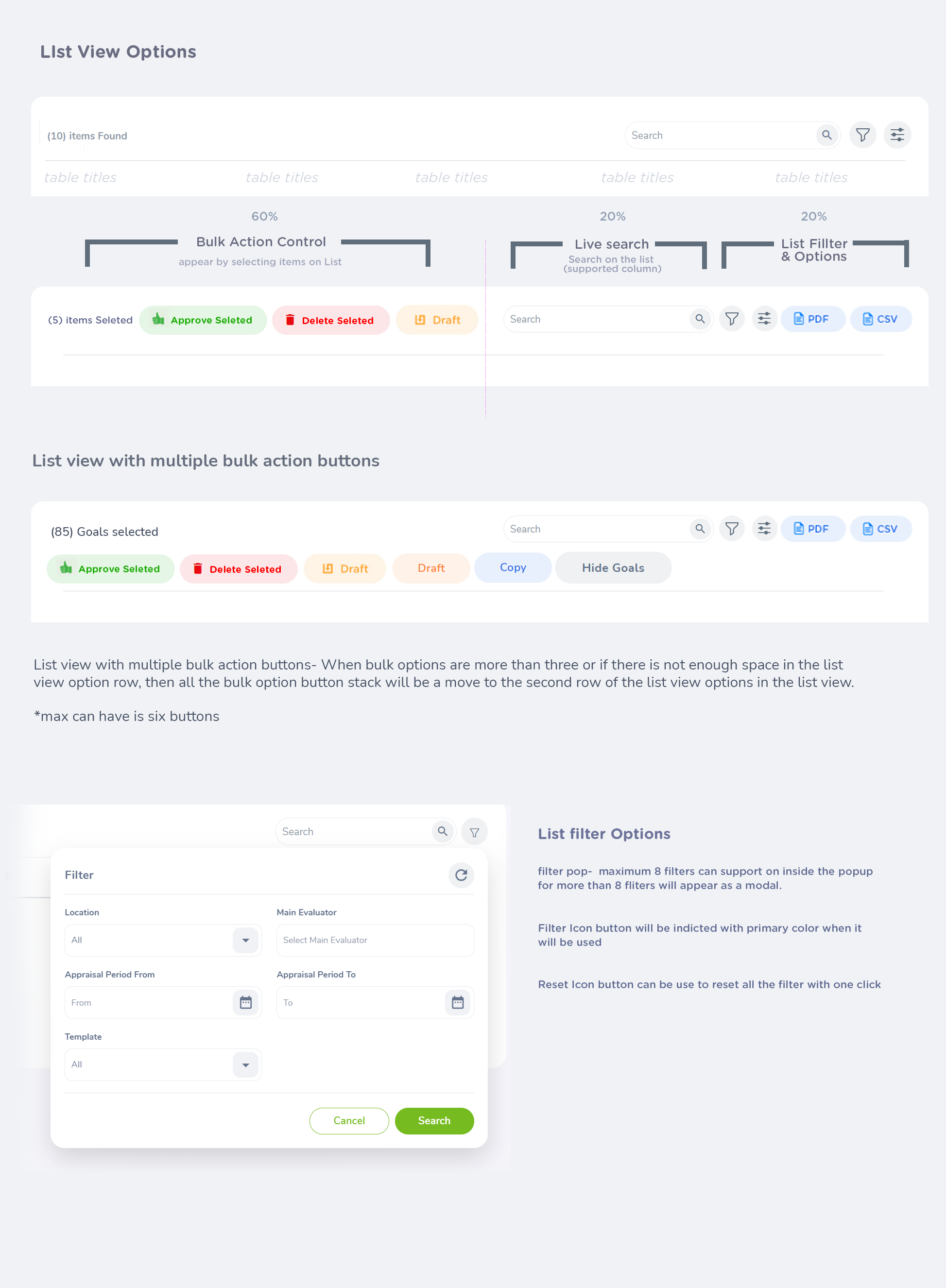
With No Borders and List row Option only appear when hover, because of this behaviors and styles this list has cleaner and lightweight than advance OXD tables recommended to use in small list items and folder UI structures
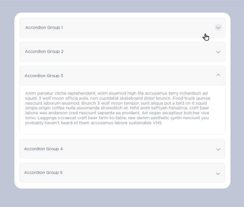
                      .accordion {
                              color: #64728c;
                              font-size: 14px;
                              border : 1px solid #e8eaef;
                              background-color: #fafafc;
                              title-align: middle;
                              border-redius: 1.2rem

                              //expand backgound: #fff;
                          }
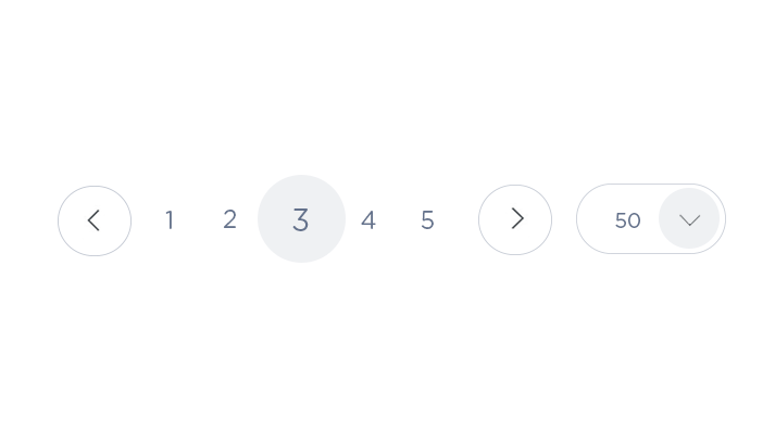
                   .oxd-Pagination {
                    font-size: 12px;
                    font-weight:600;
                    border-radius: 50px;
                    height: 36px;
                    color: #64728c;
                    border: 1px solid #929baa;
                  }

                  .oxd-Pagination active {
                    color:#64728c;
                    background-color: #F1F2F5;

                  }

                  .oxd-Pagination hover {
                    color:#fff;
                    background-color: #ff7b1d;
                  }
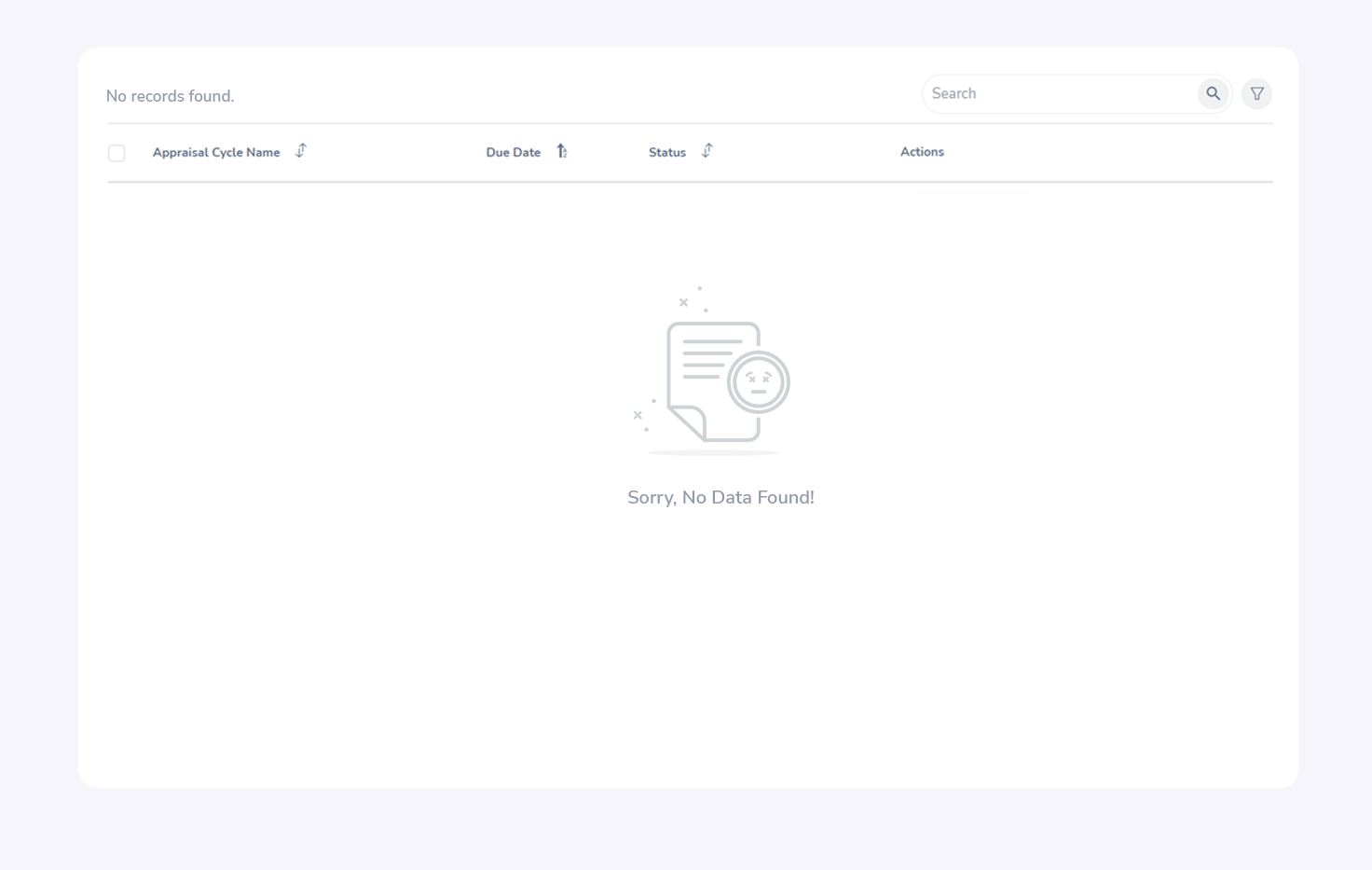
When List is empty, empty states message (with the image) will appear middle of the list view, Even the card is empty table card will remain to expand to near screen resolution or keep min-height as 75hv as default,
Top list records counter will replace as "No record found", however,terminology can be deffer based on the content.
No data found graphic will be place at middle center of the card, image-size:150px x 150px.
'Sorry, No Data Found' text will be shows under the image = color:929baa font-size: 14px; font-weight:600
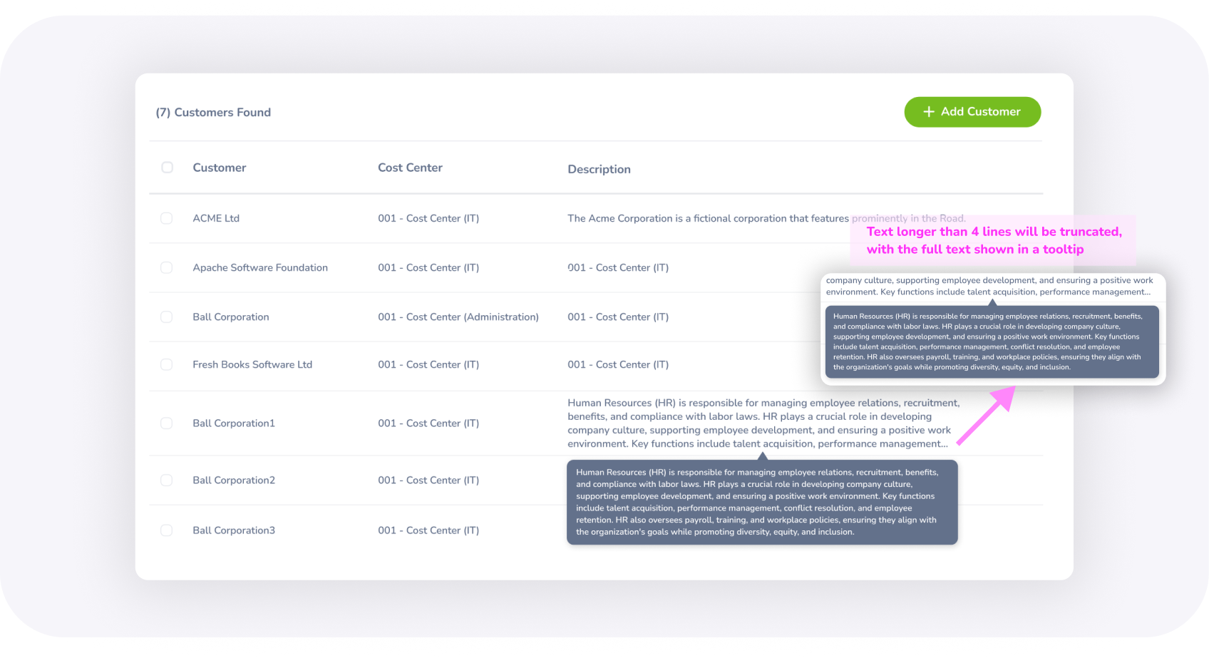
For content with 50 to 300 characters, truncation does not occur. However, for content exceeding 300 characters, text will be truncated
To view the rest of the truncated sentence, a tooltip can be used on hovering the description (the text inside the tooltip should be less than or equal to 500 characters).
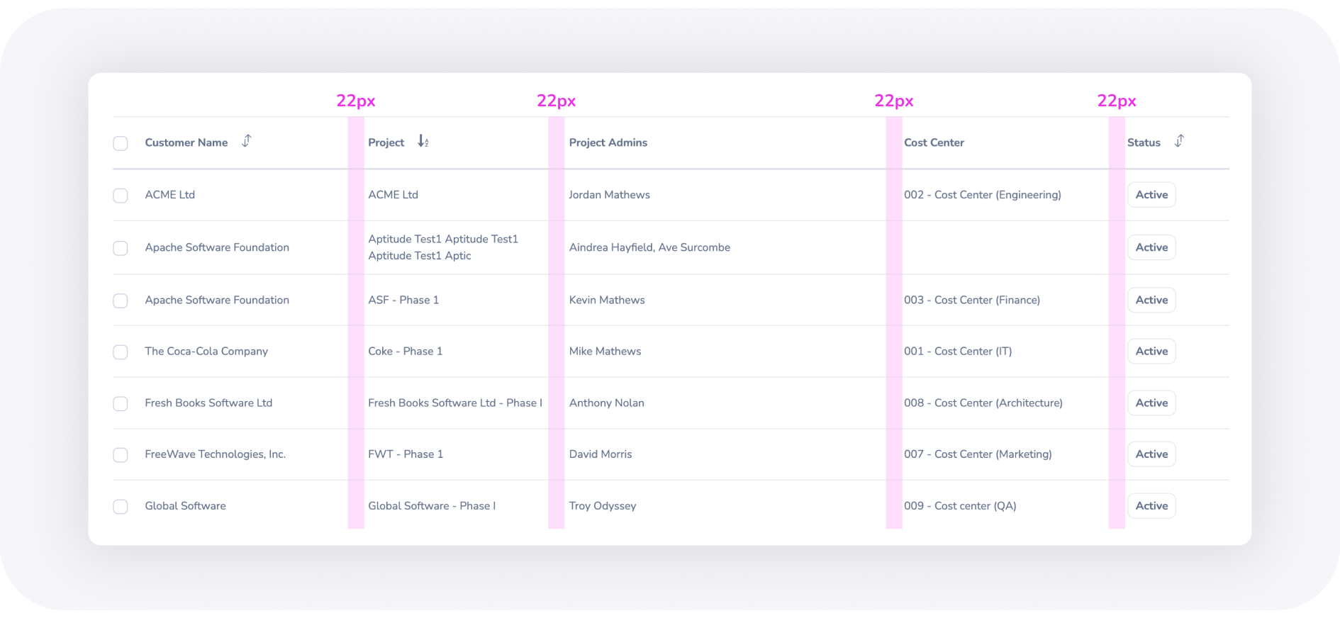
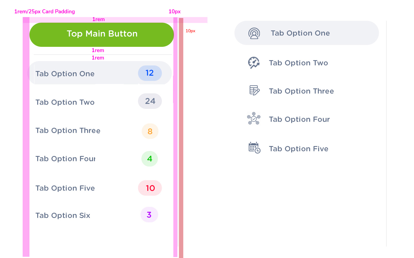
The space between two columns in a list should be 22px, with each column cell containing 11px of padding on the left and right.
The column width can be adjusted based on the number of characters to be included
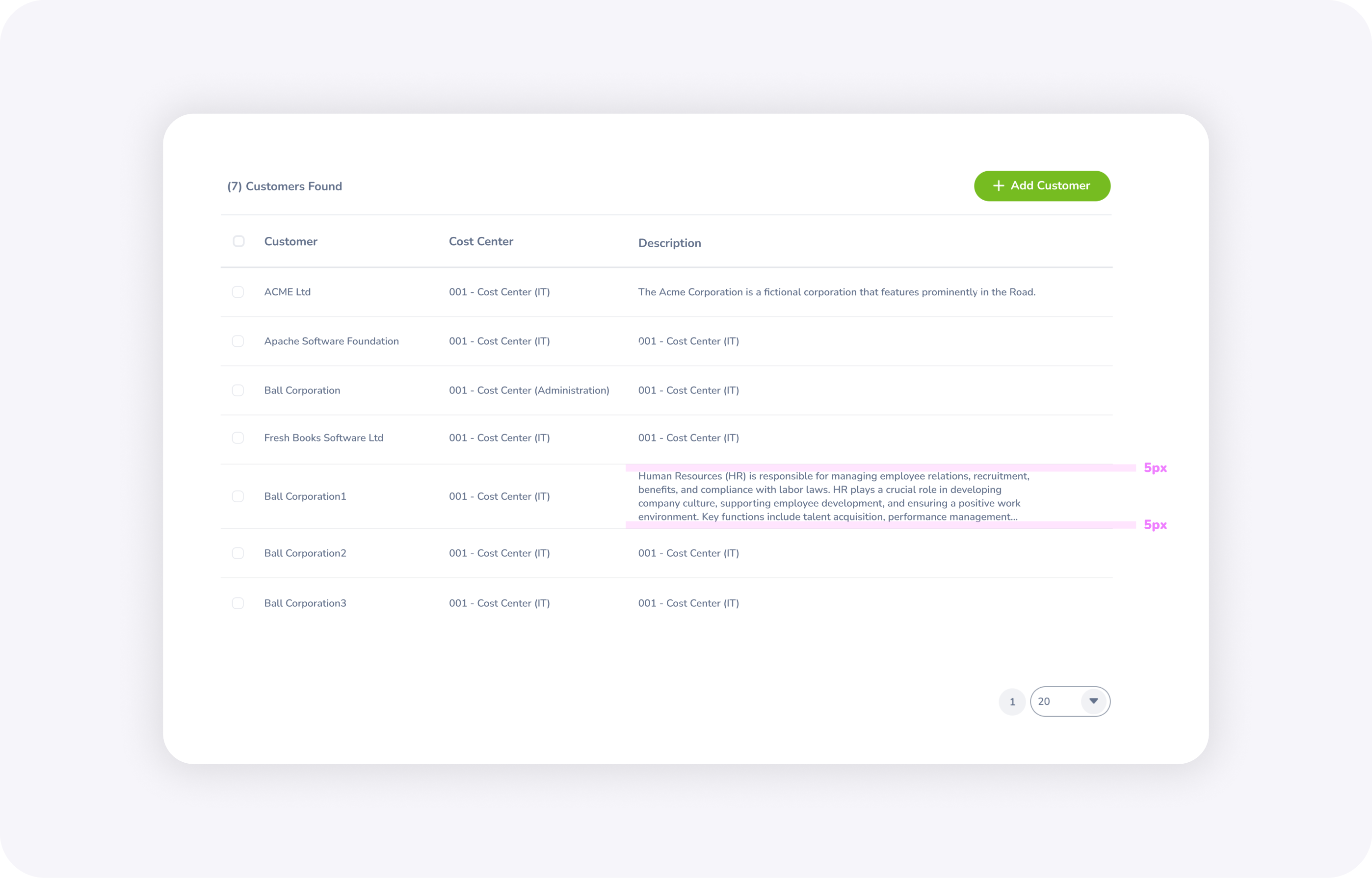
The top and bottom padding for the description should be set to 5px.
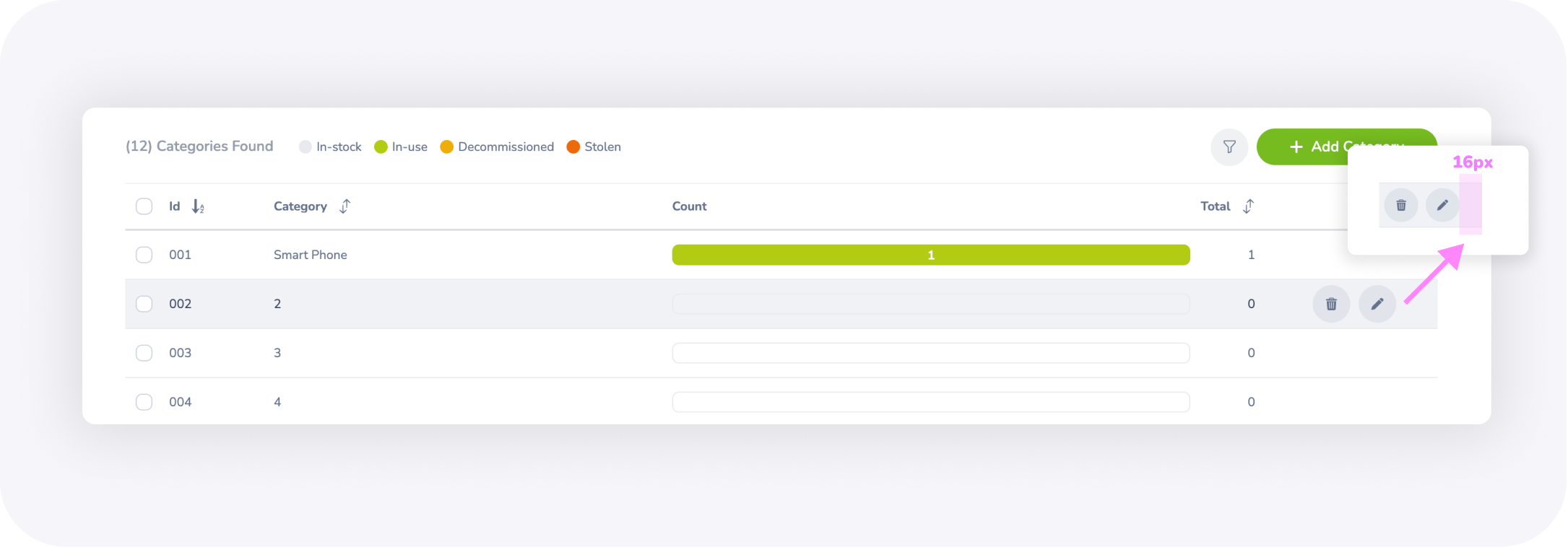
The space on the right side should be 16px, which includes 6px for button padding, 5px for cell padding, and 5px for row padding
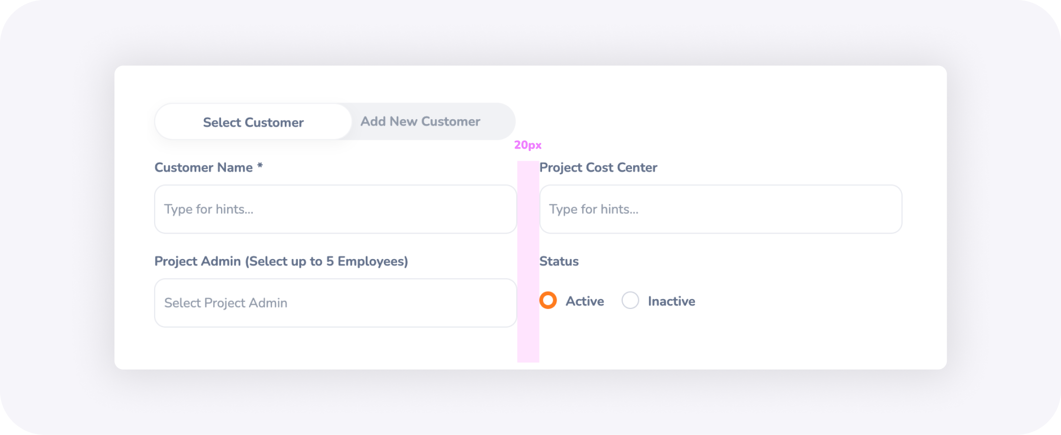
The space between two text fields in a modal should be 20px, where each text fields having 10px of padding for left and right.